work /
Corpus
Building Quin’s Design System for consistency, collaboration, and innovation in healthcare
Quin | Amsterdam 2021 - 2023
About Quin
Quin builds digital tools to help make healthcare more accessible by connecting GP practices, patients and specialists. Their goal is to simplify care paths and support a strained healthcare system.
Business challenge
When I joined the project, Quin had a strong brand and lots of visual assets, but as the product offering grew, it got harder to keep things consistent. Teams worked in silos and design decisions didn’t always align.
To scale properly, we needed more than tools. We needed a design system to support good structure, smooth collaboration and consistent experiences across products.
The goal: create a system that teams could use and maintain easily, so we could move faster and stay consistent as we grew.
Approach
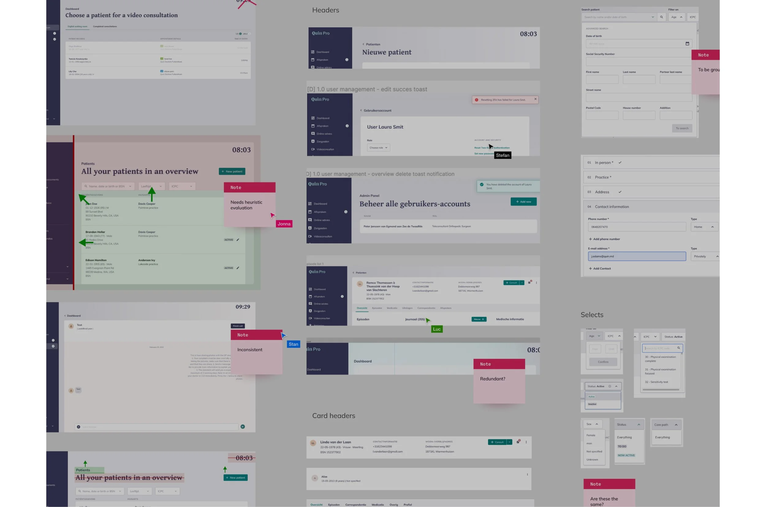
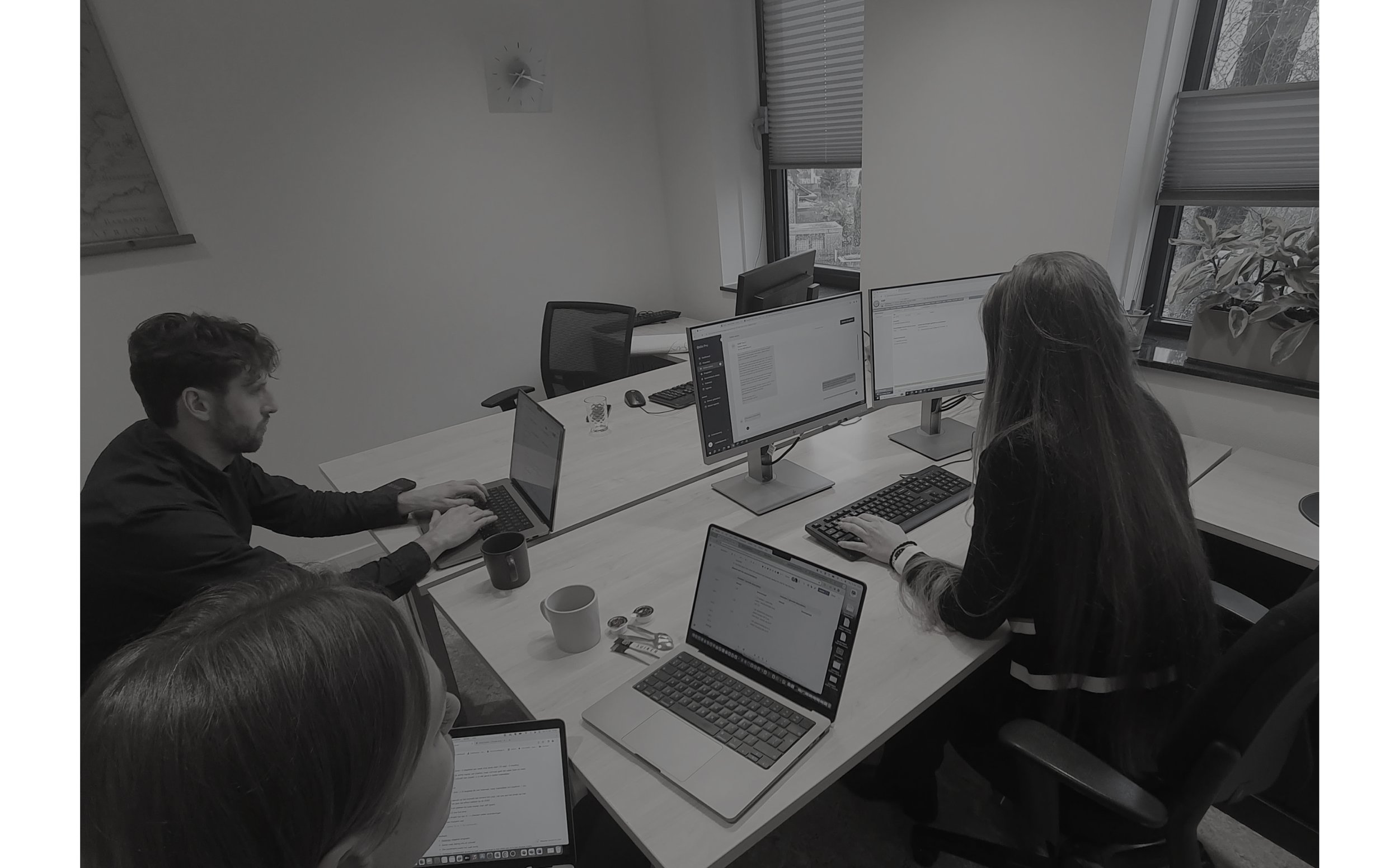
We started by understanding where things stood. We looked at workflows, talked to designers and developers, and ran audits of components and assets.

Component & Pattern Audit: Found overlap, gaps and messy inconsistencies.

Asset Inventory: Uncovered duplicates and missing pieces.

Stakeholder Challenges: Spoke with teams to understand their pain points.

Design System Workshop: Aligned on what the system should do and how it could help.
Key-insights
Through this process, we learned that:
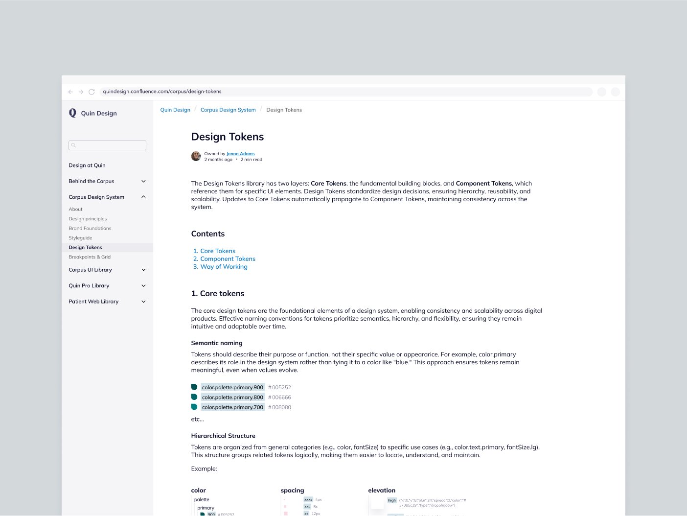
Scalability needs structure
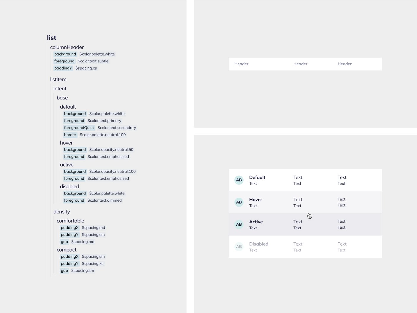
Design tokens helped make everything more flexible, accessible and easier to manage.Consistency needs shared rules
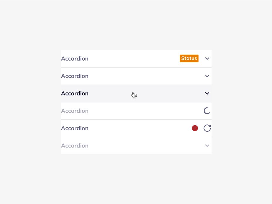
Reusable components and clear documentation improved team efficiency.Quality needs systems
Redesigning key components raised the bar for product quality and made scaling easier.Structure needs collaboration
Getting design and dev to work closely changed how we worked for the better.
These insights shaped the system from the ground up.
My role
I helped design and shape Corpus with a focus on usability, accessibility and scalability.
I co-led the design token strategy with a developer, created reusable component structures, set documentation standards and brought teams together to improve handoff.
It was a collaborative process with constant iteration and testing to make sure the system really worked for everyone.

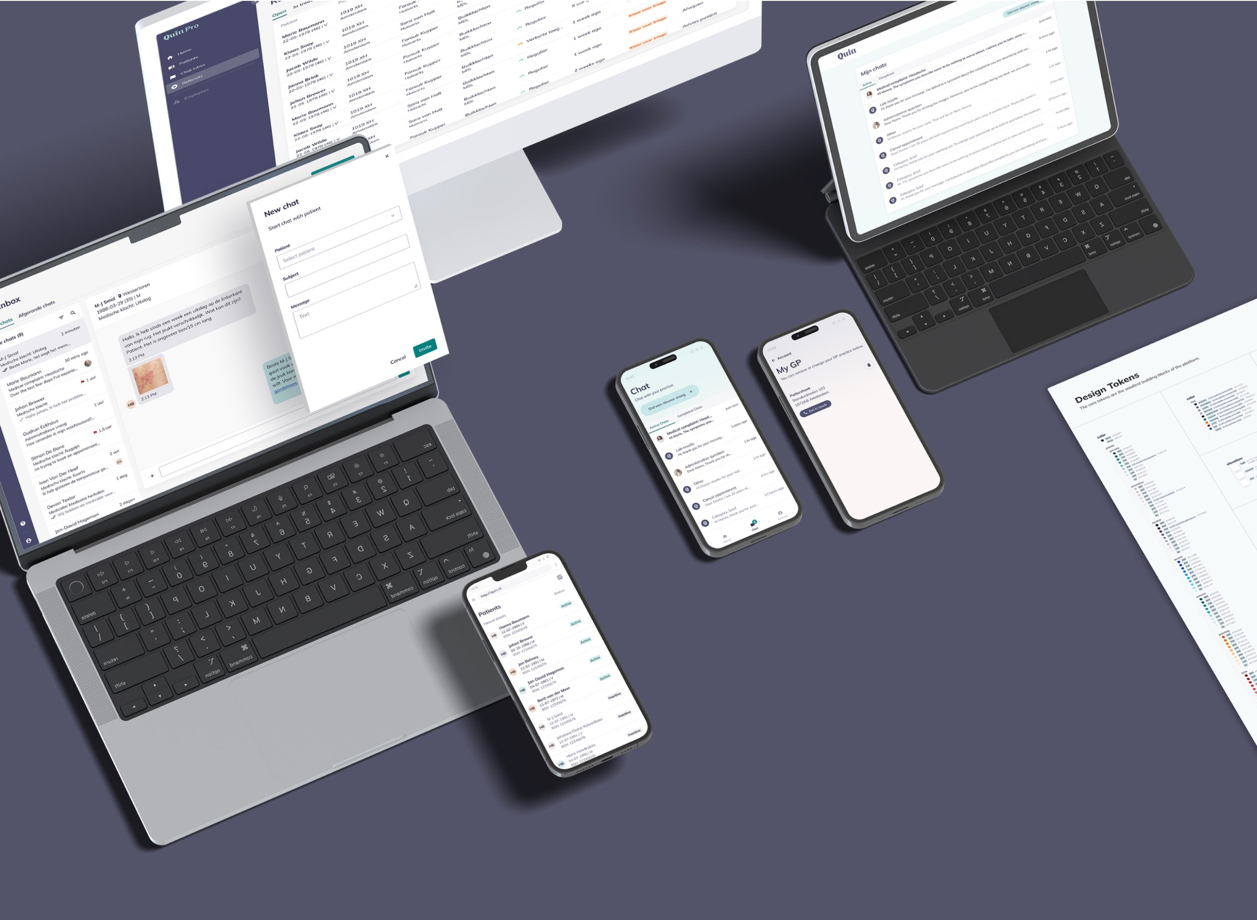
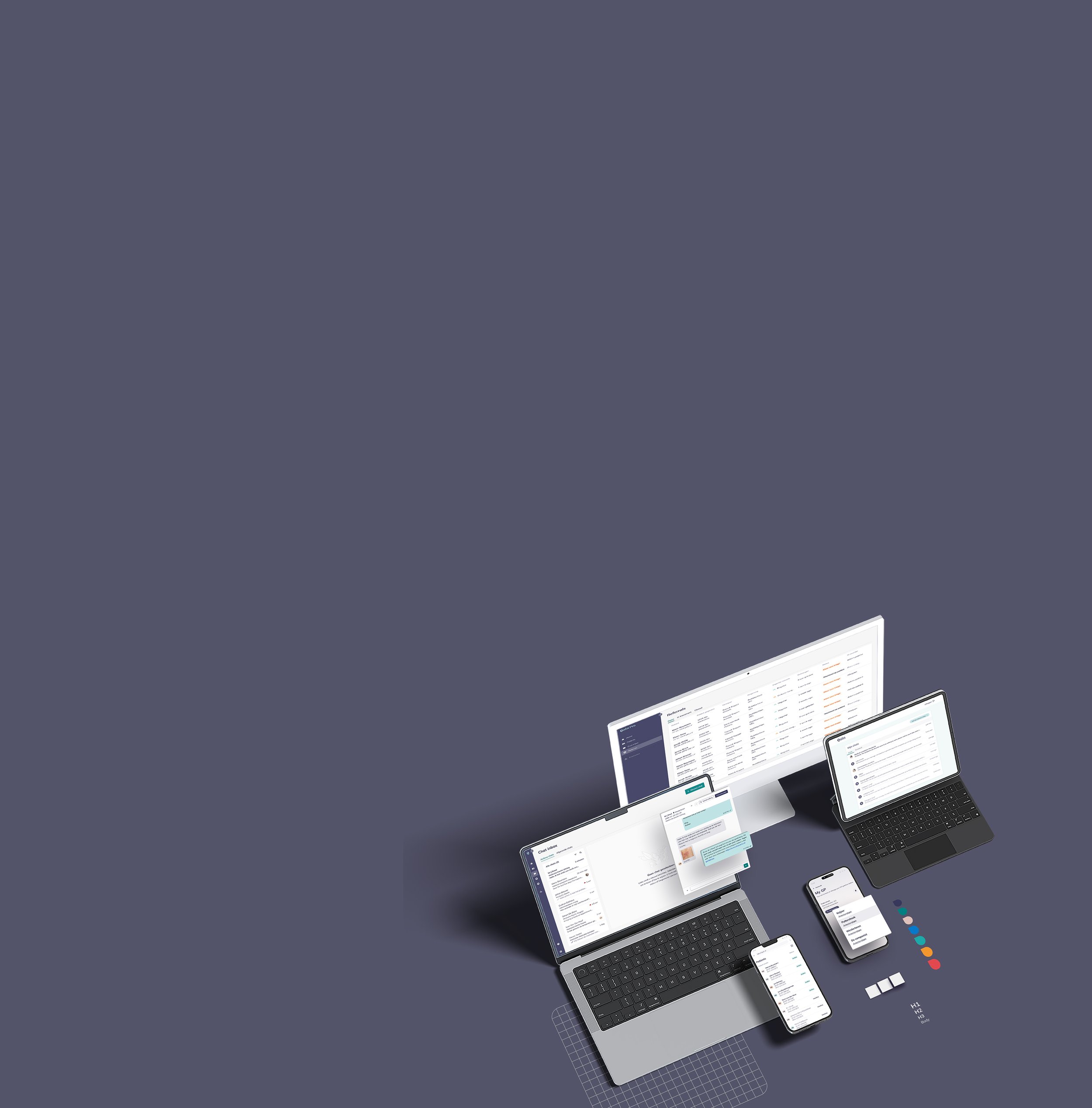
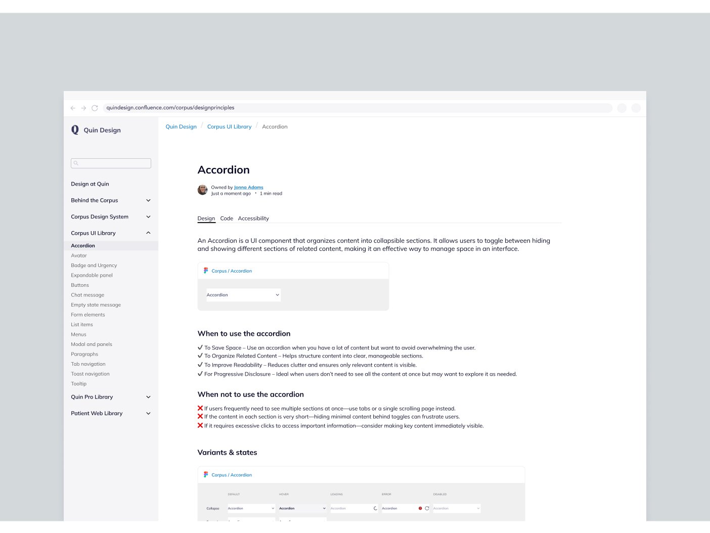
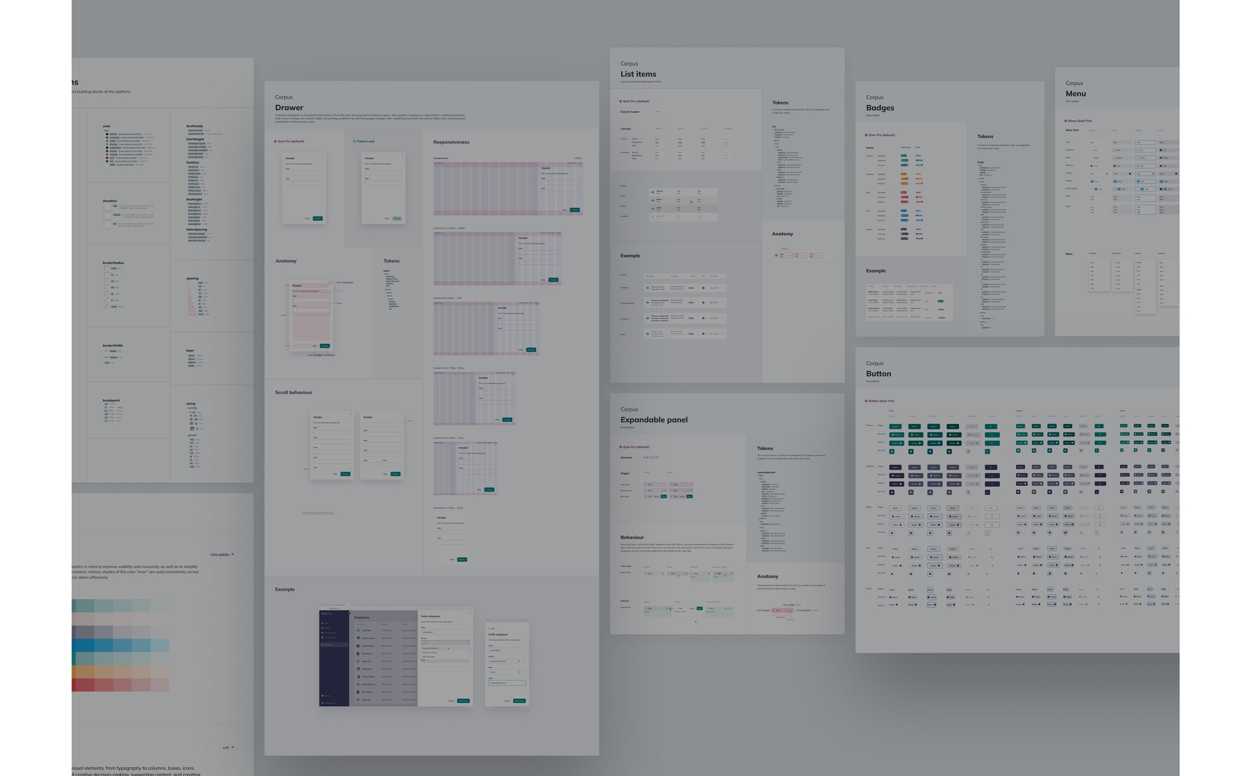
Introducing Corpus Design System
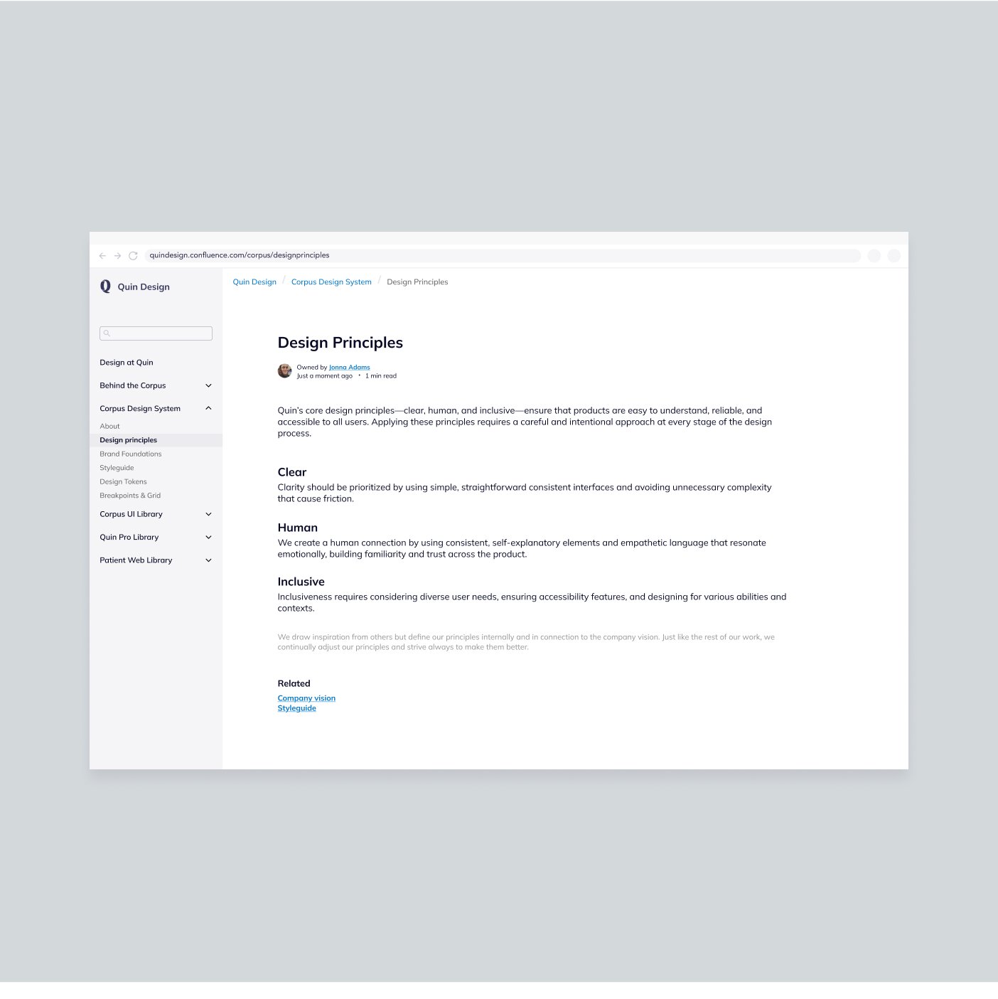
Corpus means “body” or “structure,” and that’s what this system became for Quin: the backbone of how we build products.
It brought everyone onto the same page with shared principles, clear standards and a focus on real user needs.

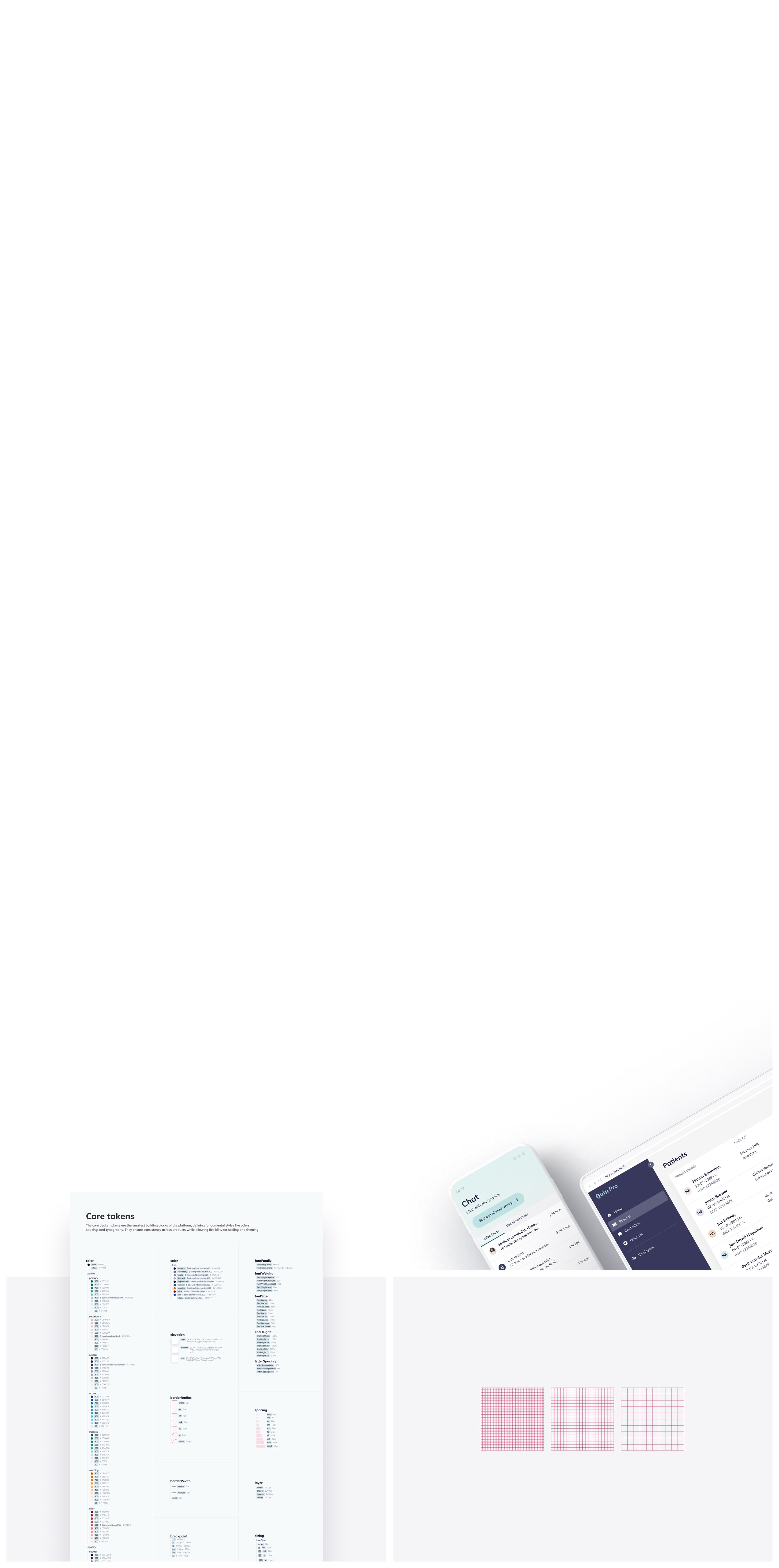
How Corpus delivers
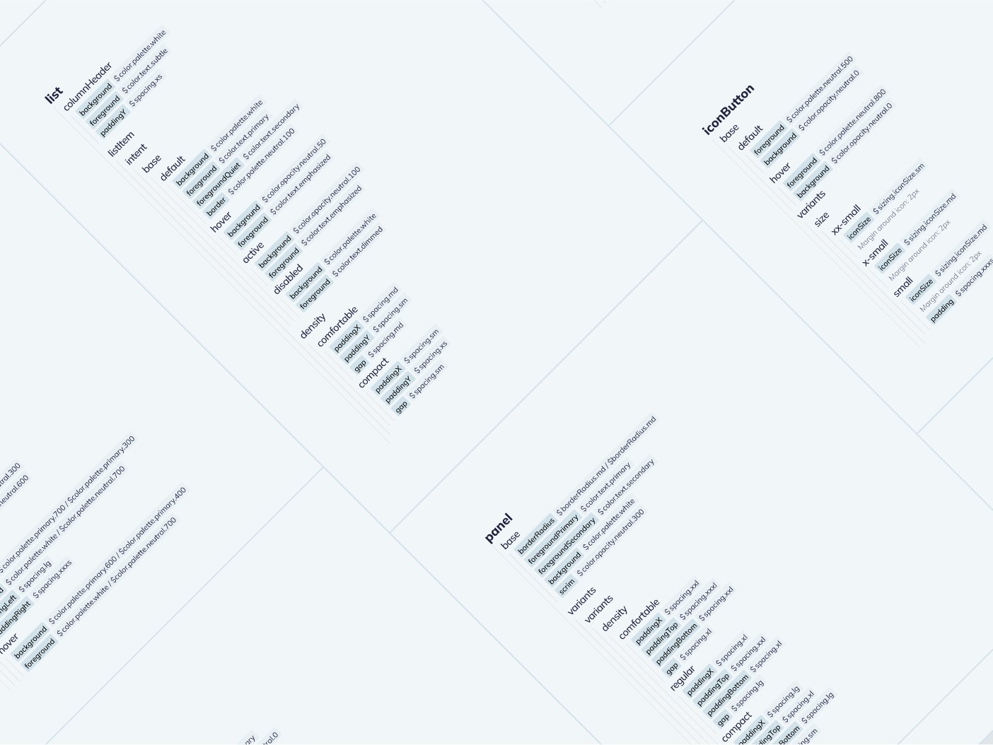
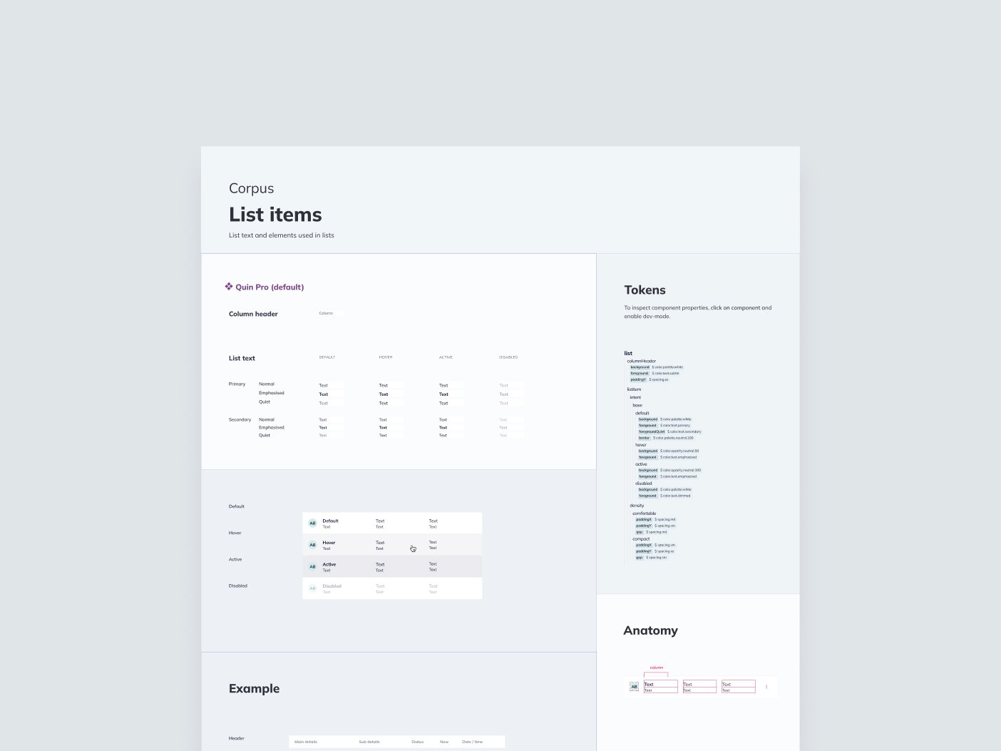
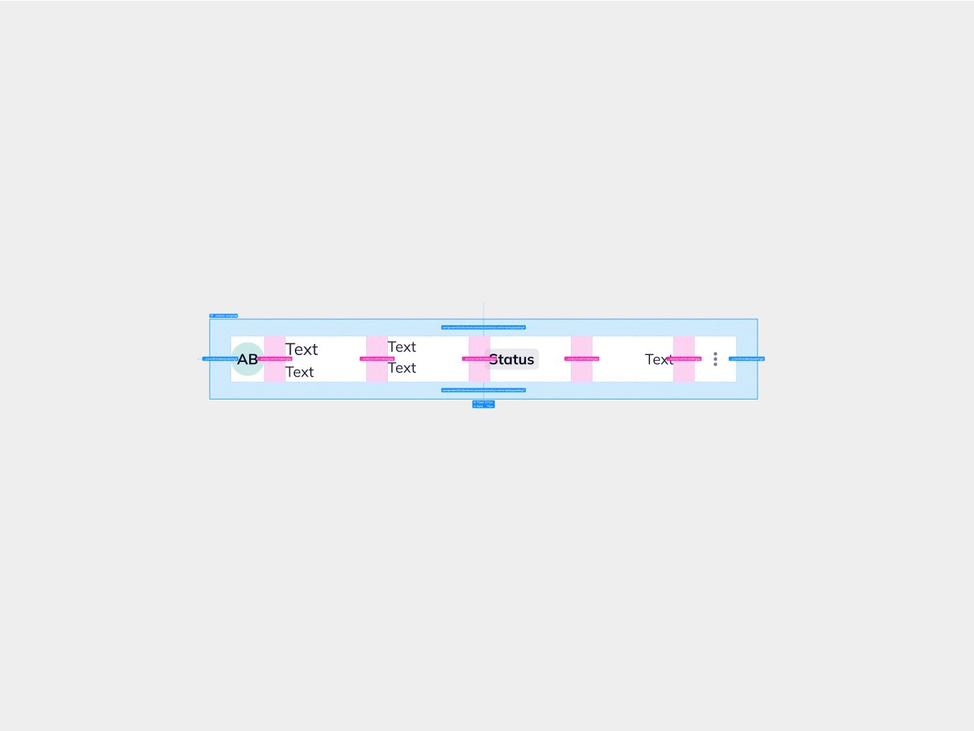
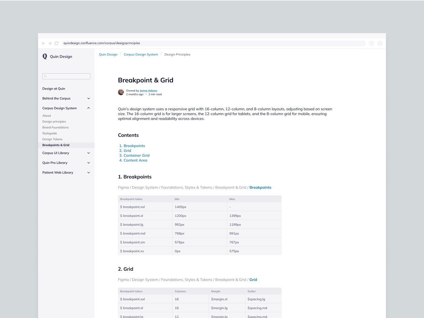
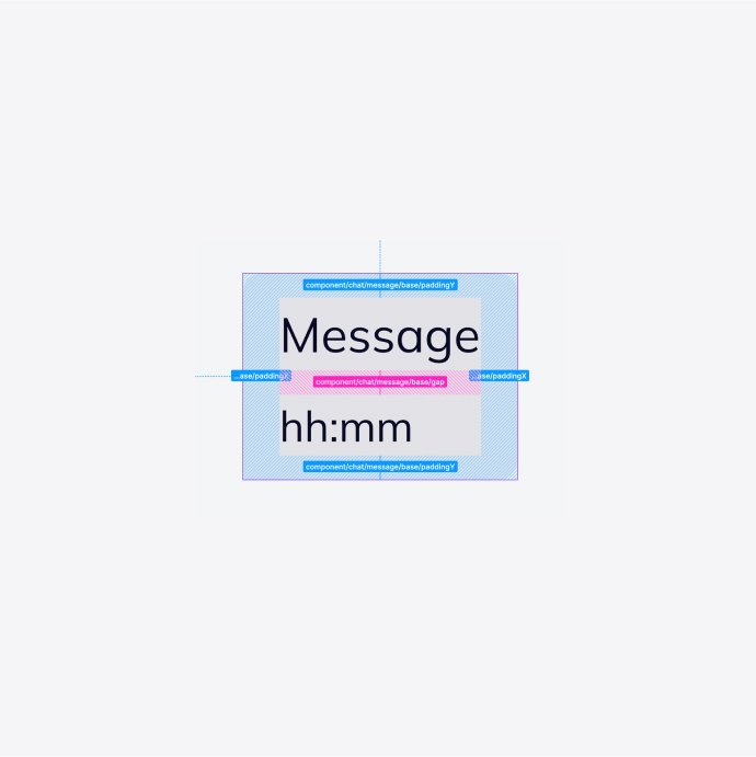
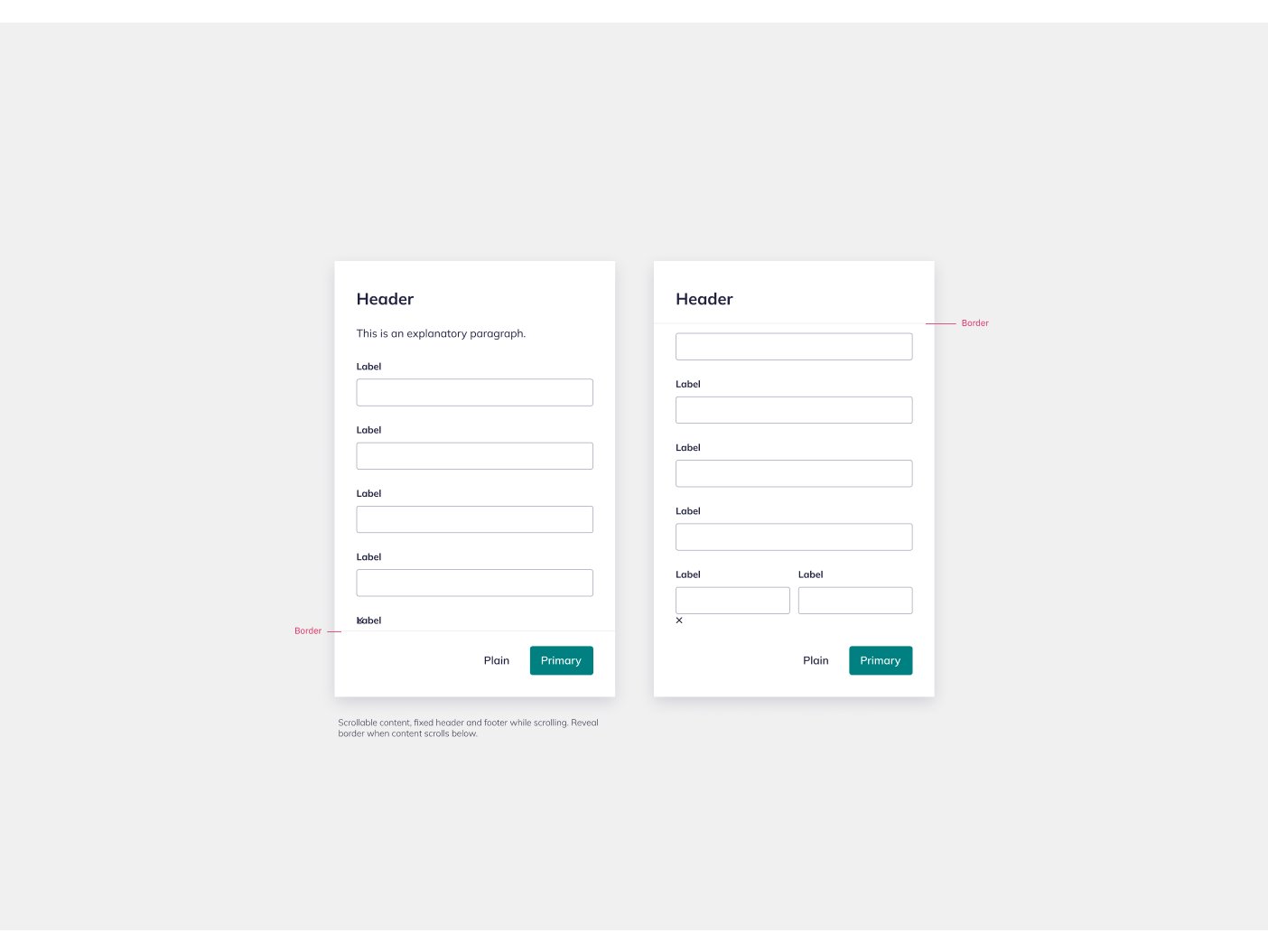
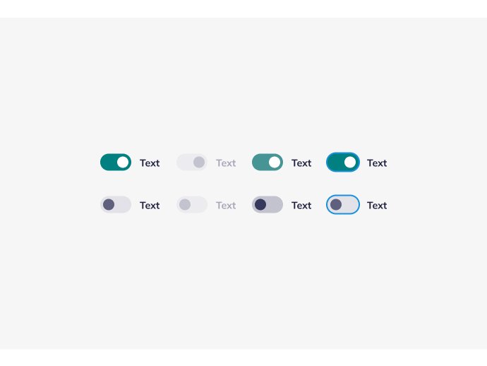
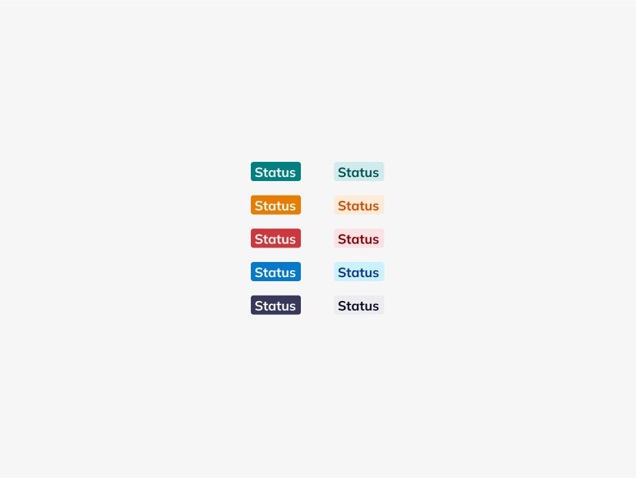
Design tokens create consistent, flexible styling.
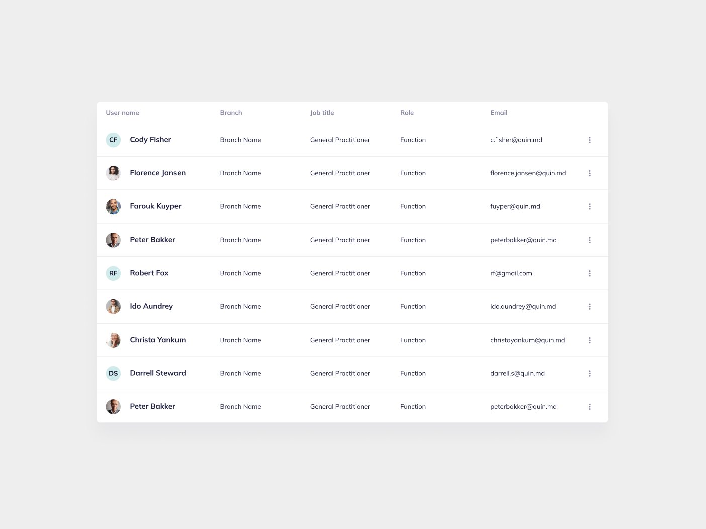
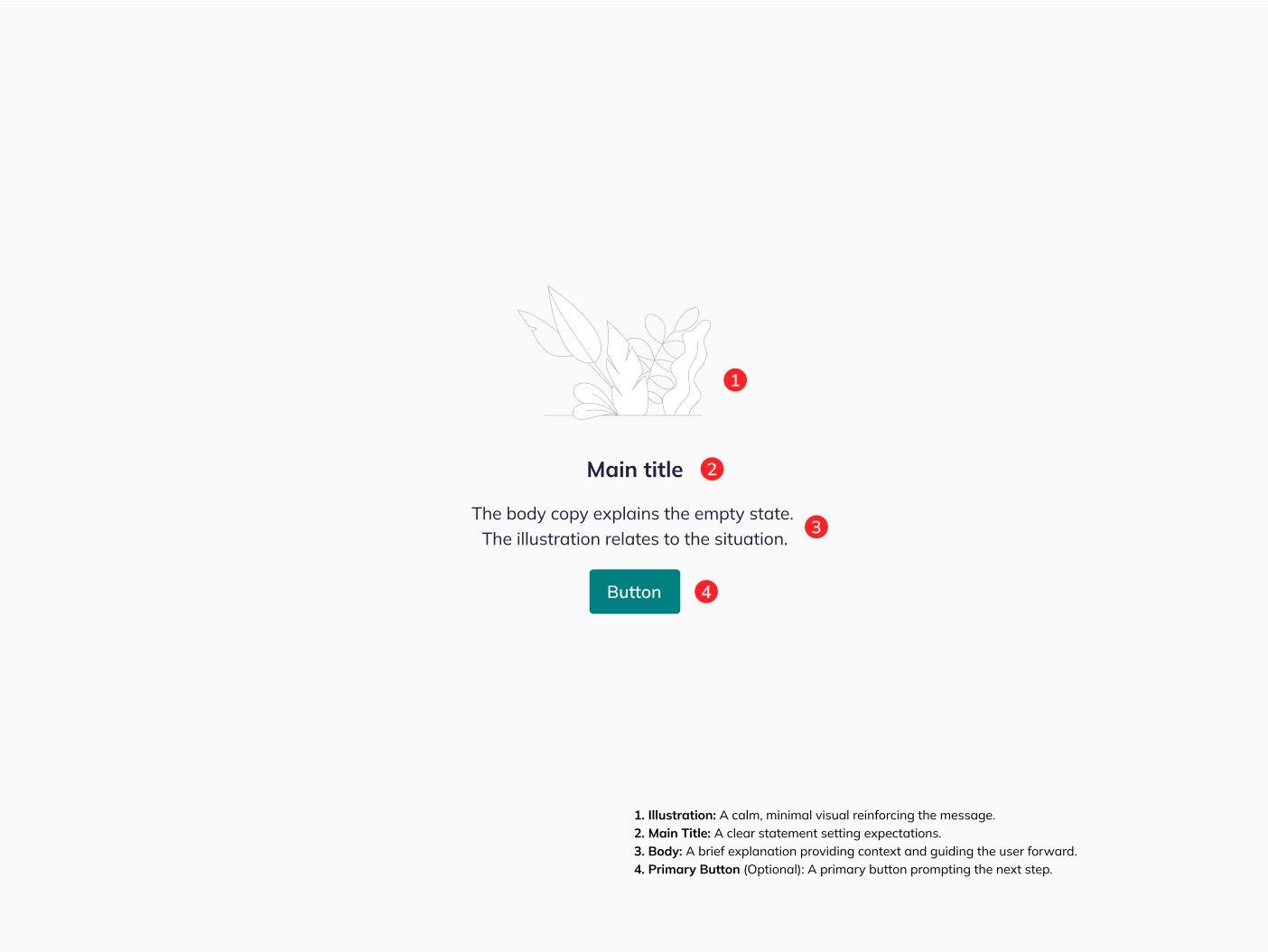
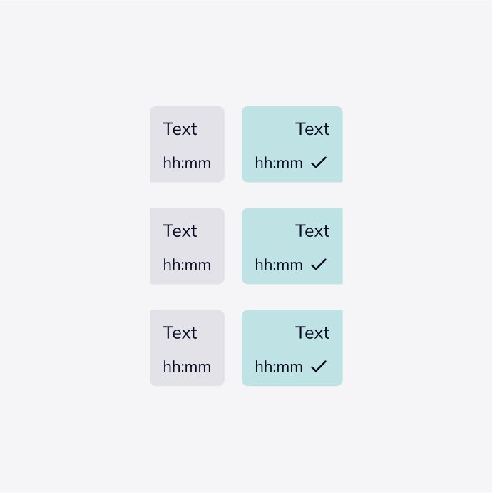
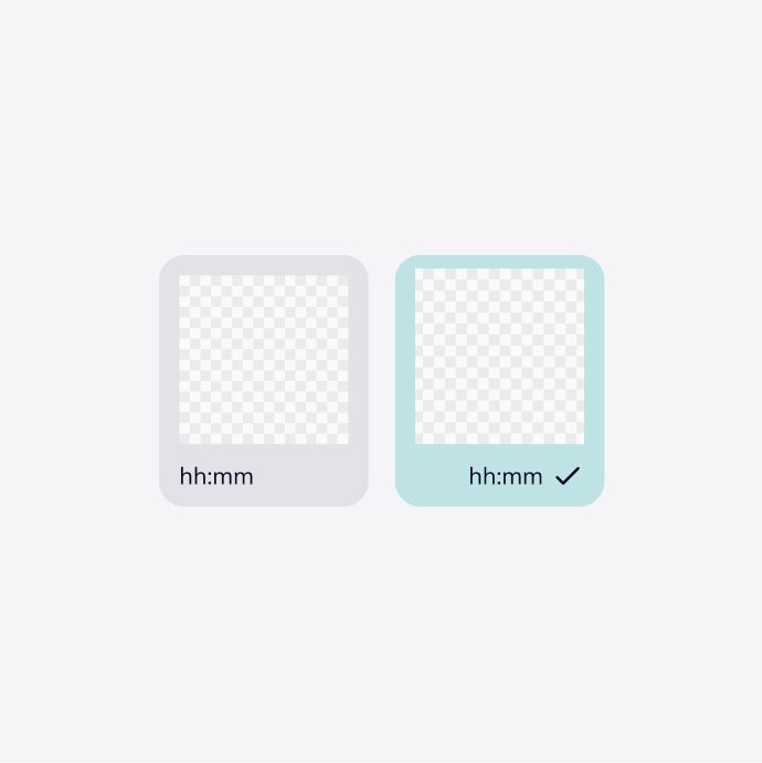
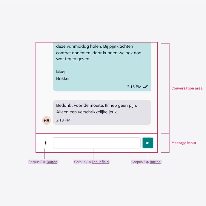
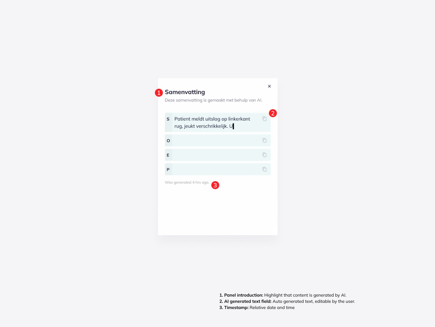
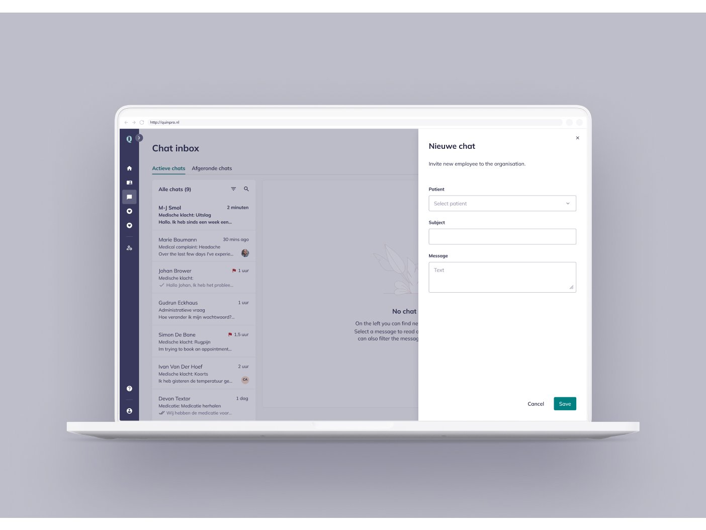
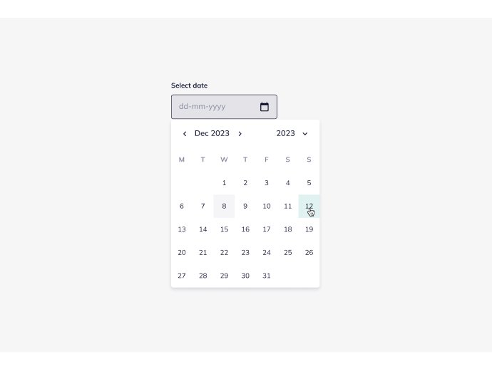
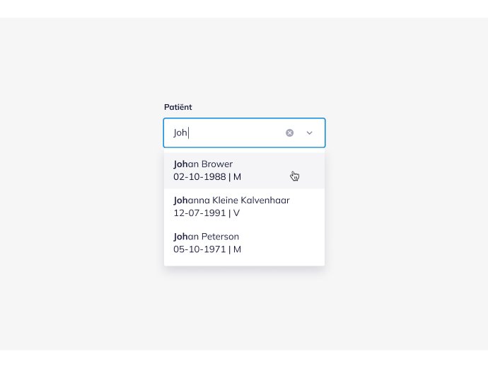
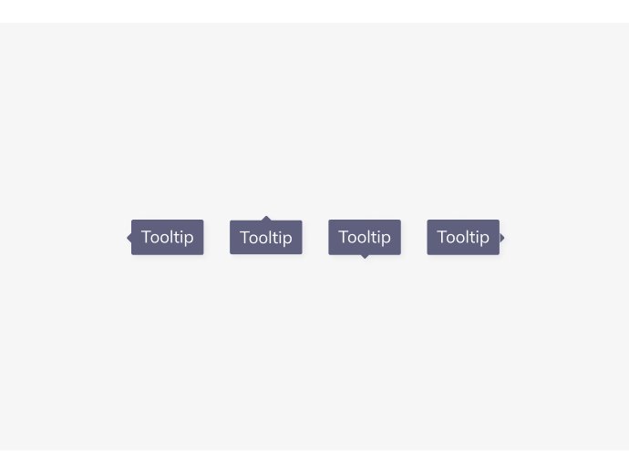
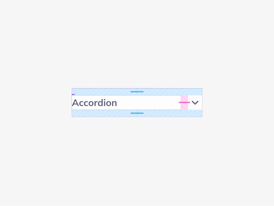
Reusable components give us a modular building system.
Patterns solve a range of UI problems.
Design and code are connected for smoother workflows.
Documentation captures decisions, principles and processes.


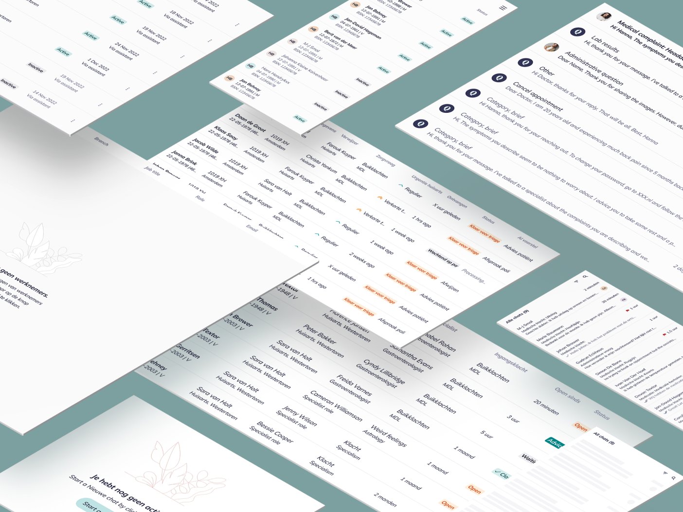
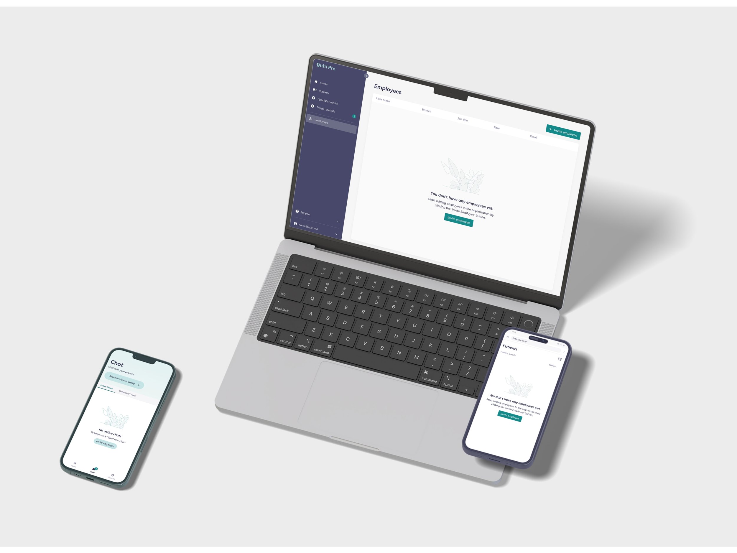
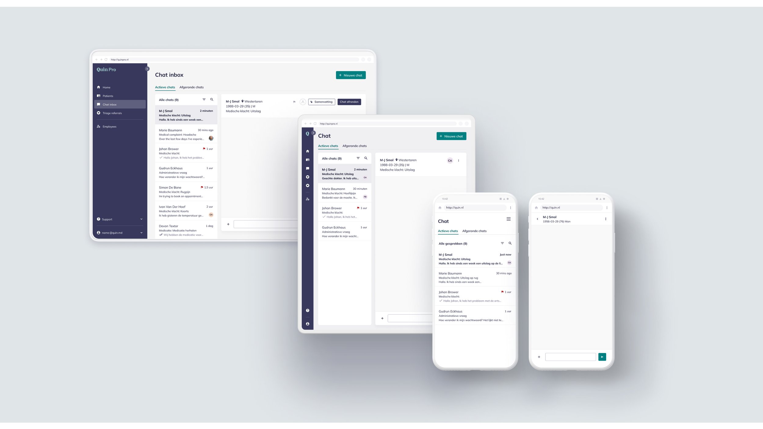
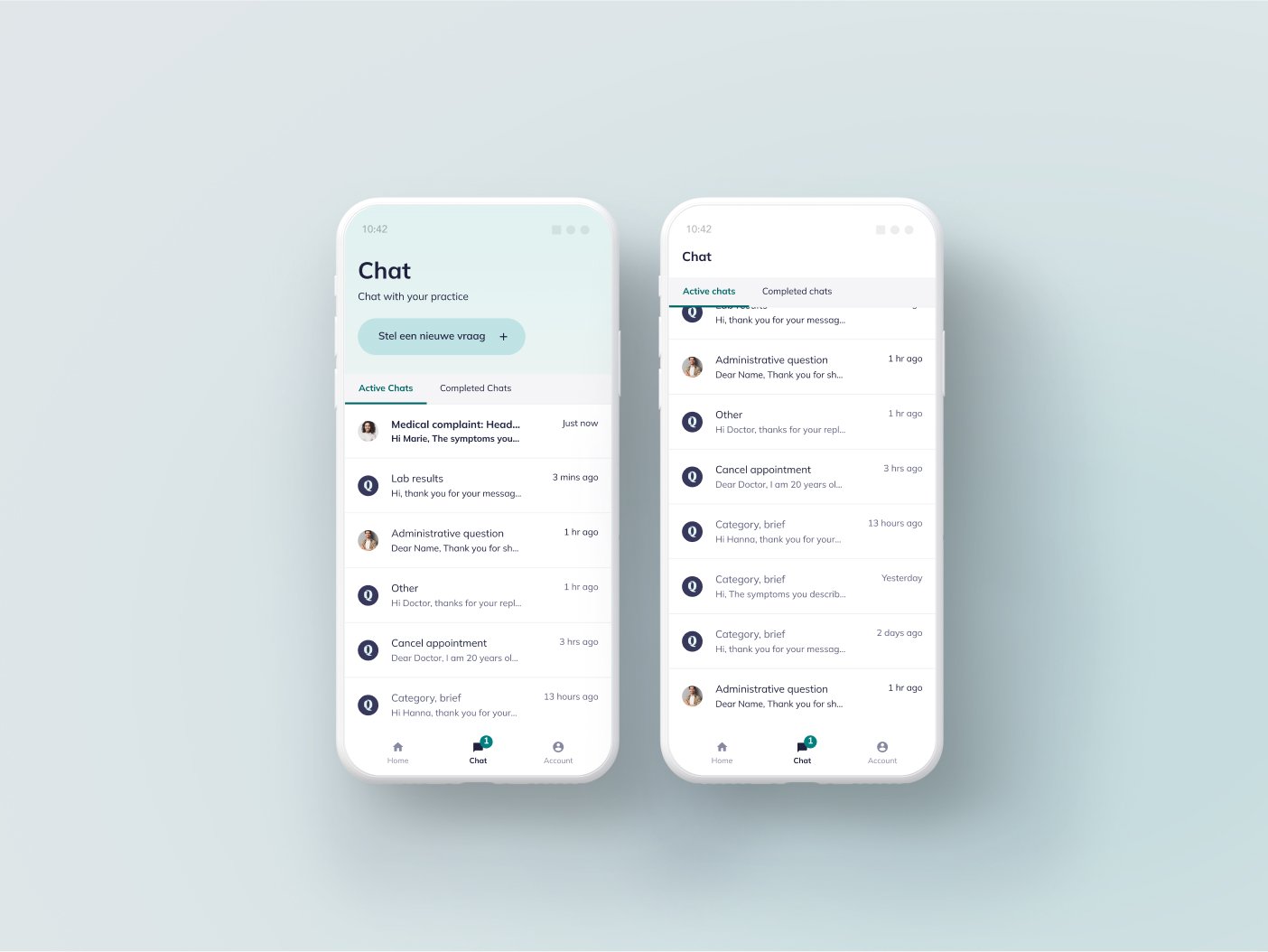
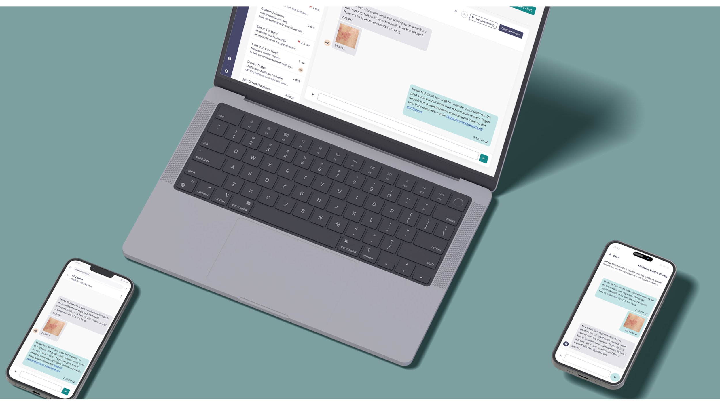
One system, two products
Corpus supports both Quin’s platforms:
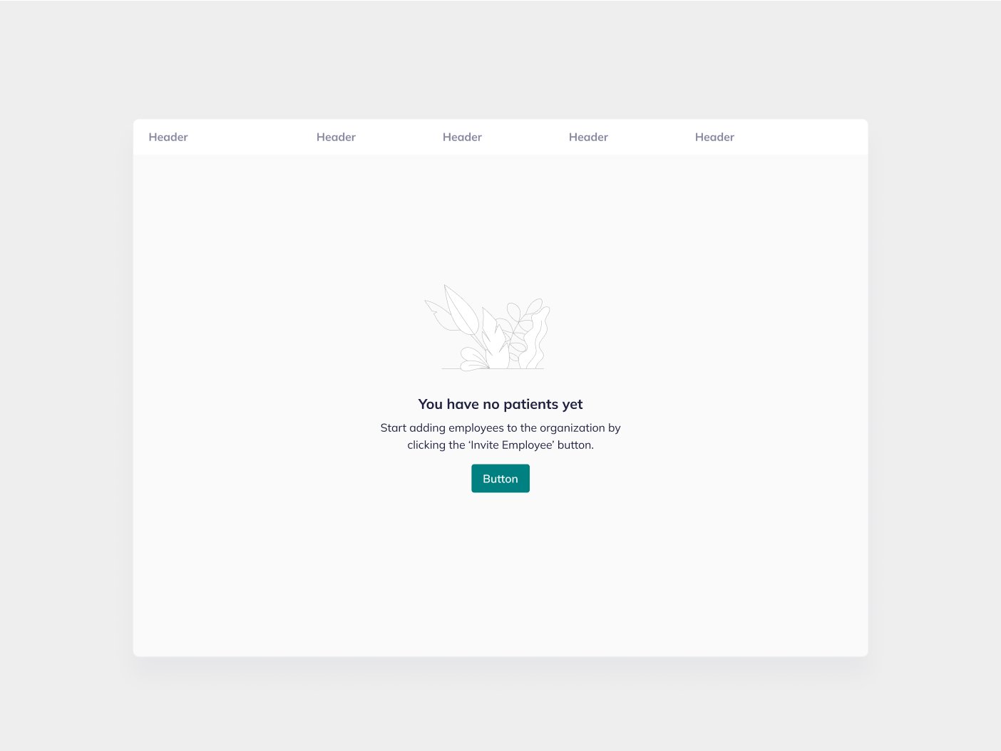
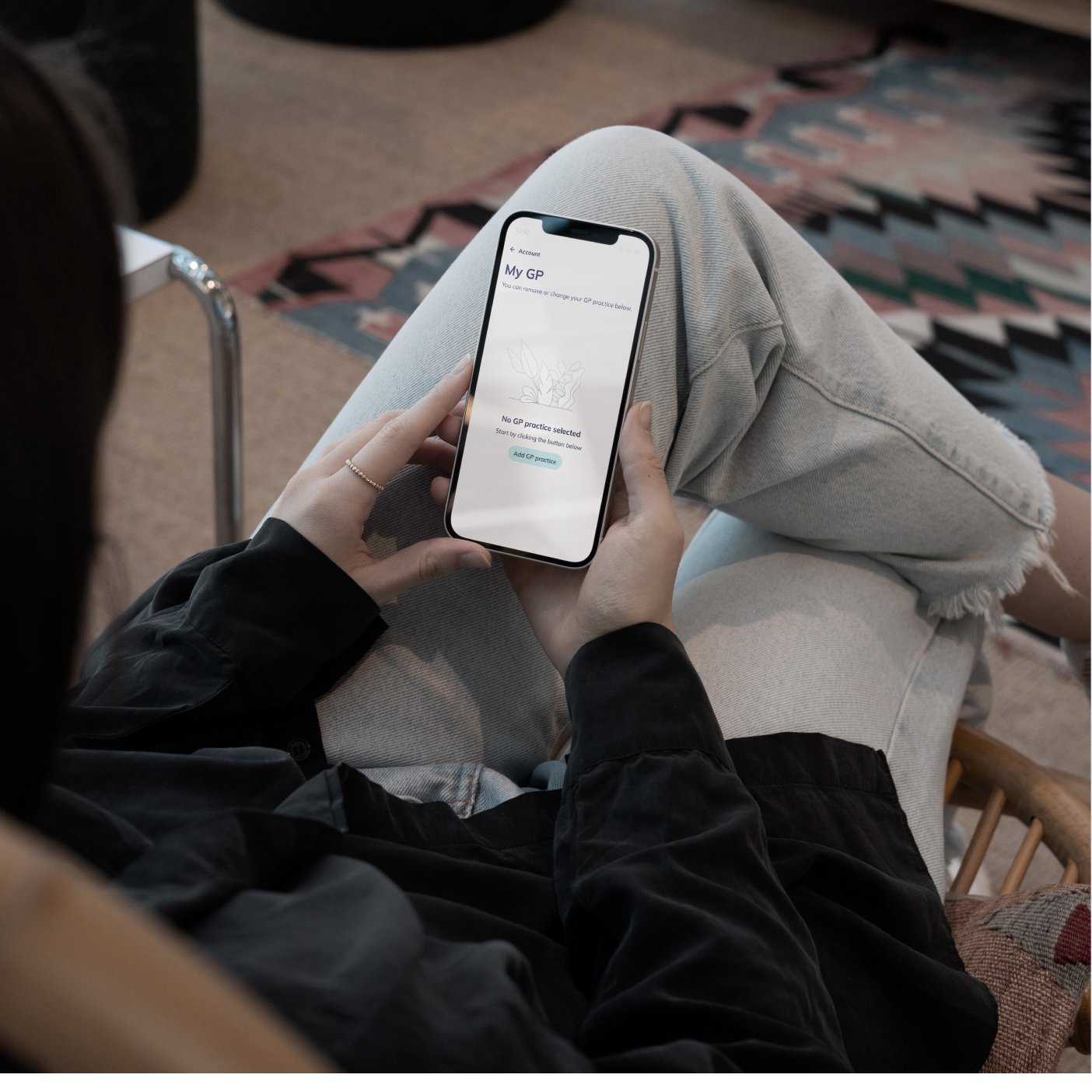
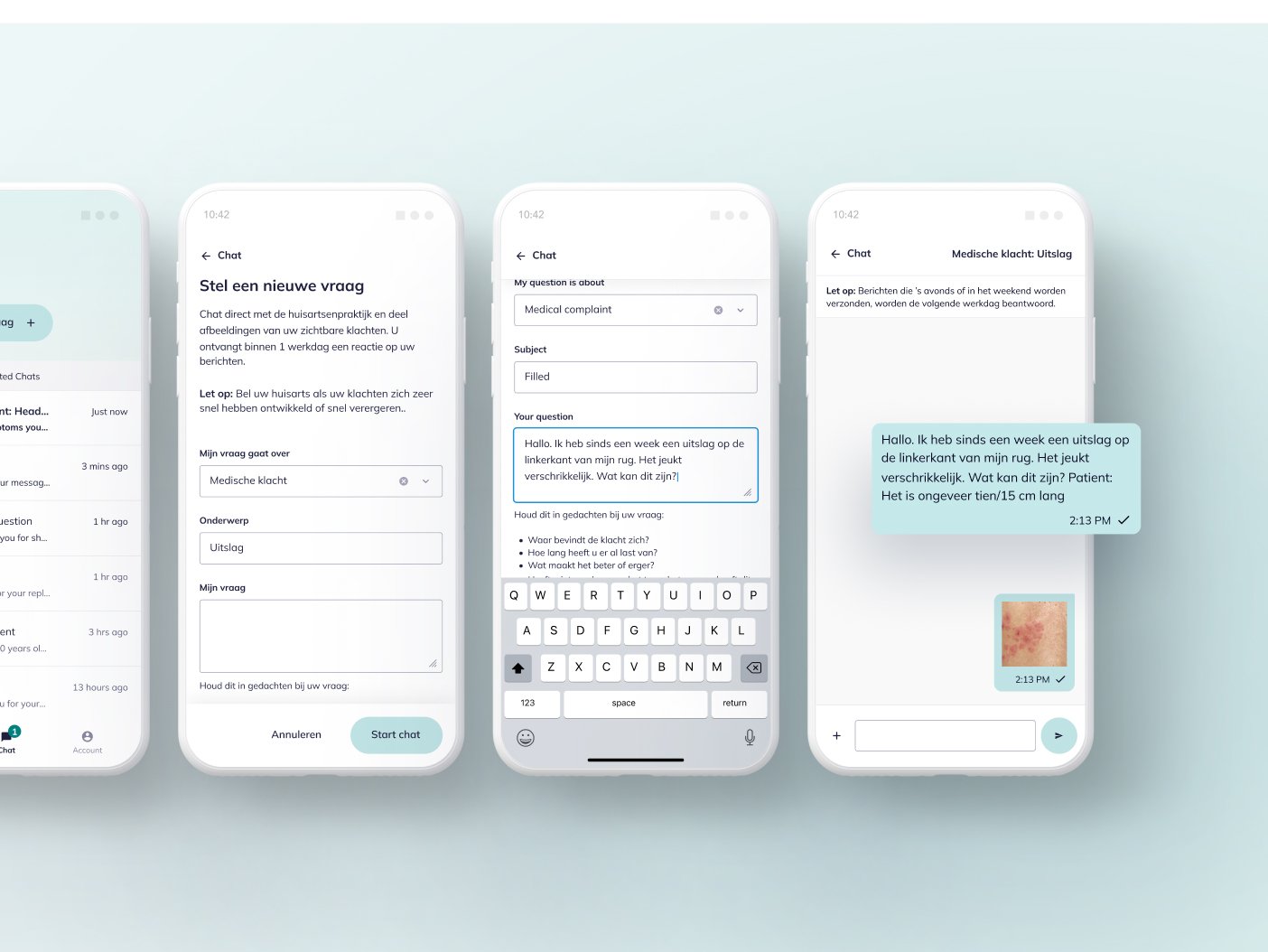
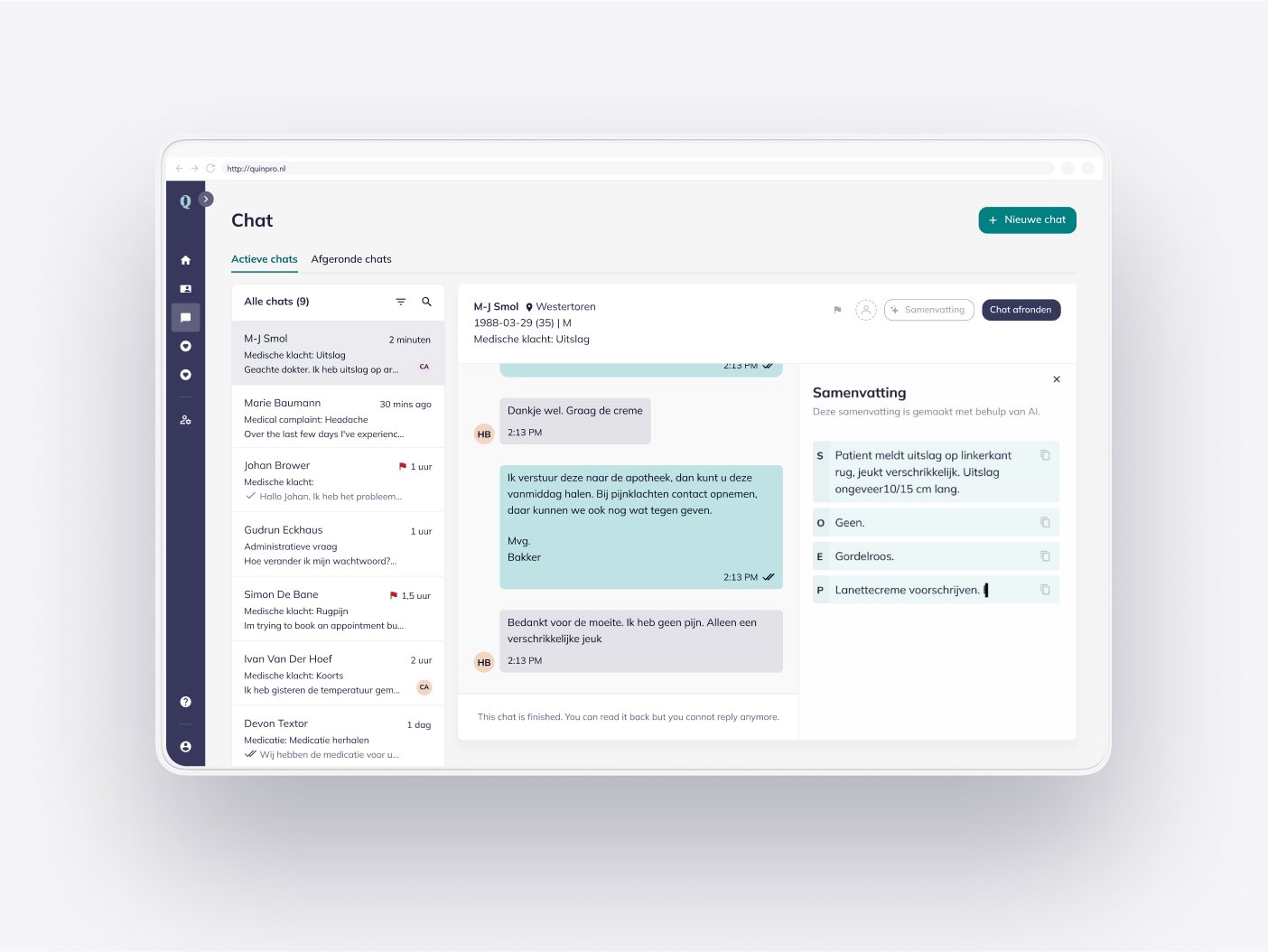
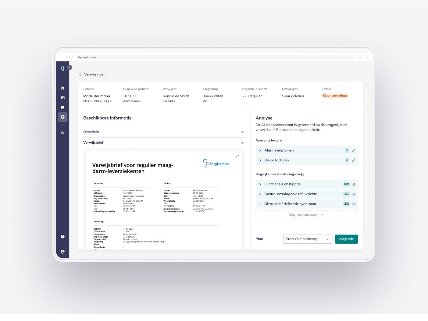
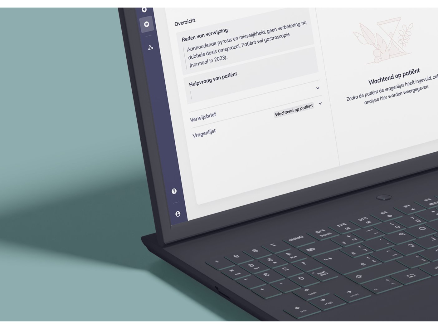
Quin Pro: For healthcare professionals.
Consumer app: For patients.
Thanks to shared principles and styles, the experiences are consistent but tailored to each audience.


Outcomes
Corpus changed how we work and build:
More consistency
Design tokens replaced hardcoded values, so designs matched the final product.More time for real work
With the basics systemized, teams could focus on UX and innovation.Better teamwork
Shared tools reduced friction and made collaboration easier.Stronger user experiences
Clear structure and thoughtful patterns led to more intuitive interfaces.
Reflection
Corpus was a turning point for Quin. It helped Quin grow in a more aligned, efficient way.
Getting everyone on board took time, but it was worth it. One of the best parts was seeing collaboration improve between design and development. At first, misalignment slowed us down. Over time, trust grew and we worked better together.
I learned how much early alignment and open communication matter. Not just for the product, but for the team.
A design system is never really done. It needs care and adaptation as products grow. The real success is in how people use it and keep it alive.
This was a big learning experience and a great example of what can happen when teams align around a shared goal.