work /
Yuki Accounting
A Modular Design System to Make Accounting Easy, Intuitive, and Enjoyable
Visma | Yuki, Rotterdam Netherlands 2019-2021
About Yuki
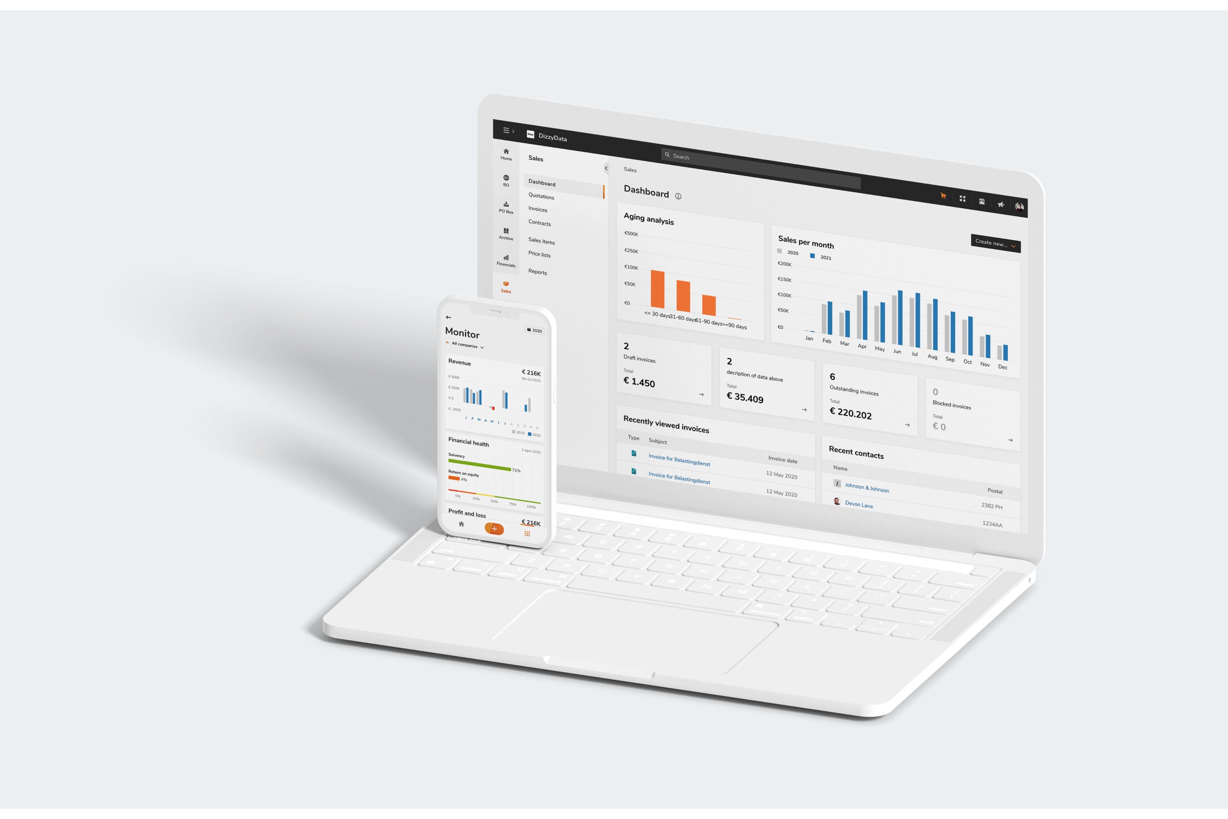
Yuki is a cloud-based accounting platform for SMEs and accounting firms in the Netherlands, Belgium and Spain. It automates key financial tasks to give users real-time insights and better control over their finances.
Business challenge
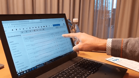
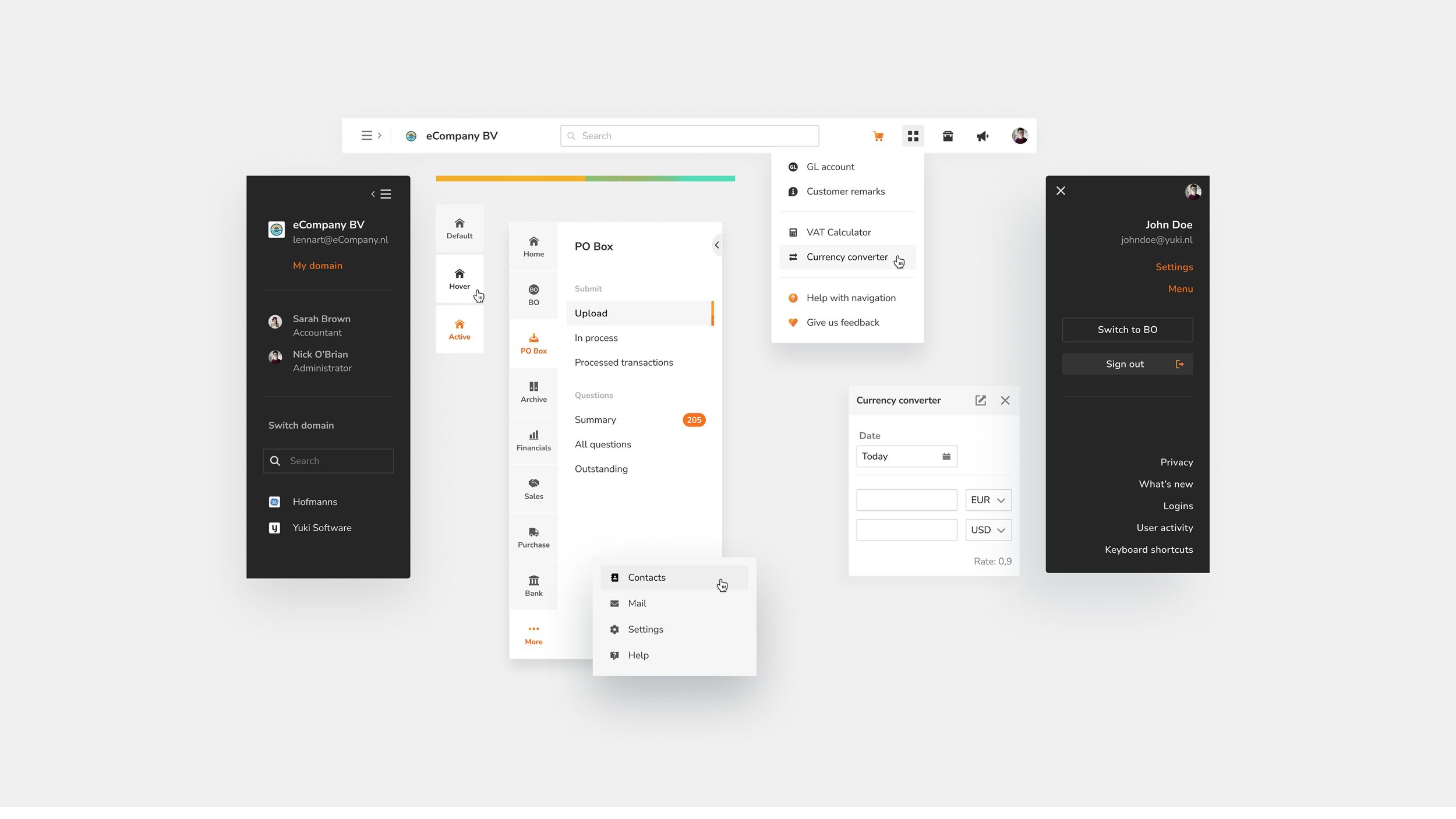
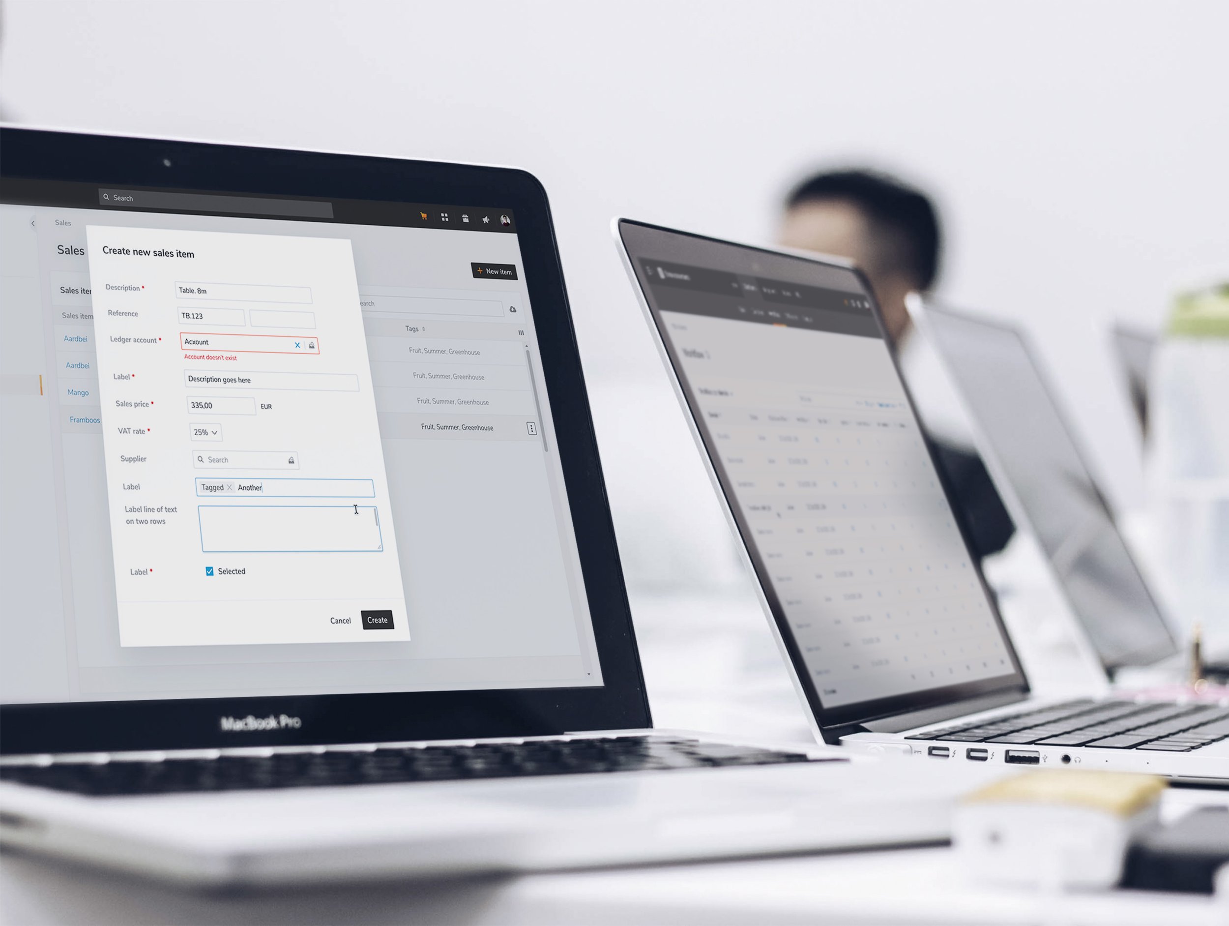
Yuki was going through a major code migration and needed to modernize its UI and UX. The platform had grown fast, with different teams designing in different ways. It worked, but the experience felt inconsistent and hard to maintain.
We weren’t just fixing visual issues. We were building a design system from the ground up to improve usability, accessibility and scalability for users and developers across multiple countries.
Why Redesign?
The platform was packed with functionality, but the experience didn’t feel unified.
Key challenges:
Inconsistent Design: Different approaches led to visual and functional mismatches.
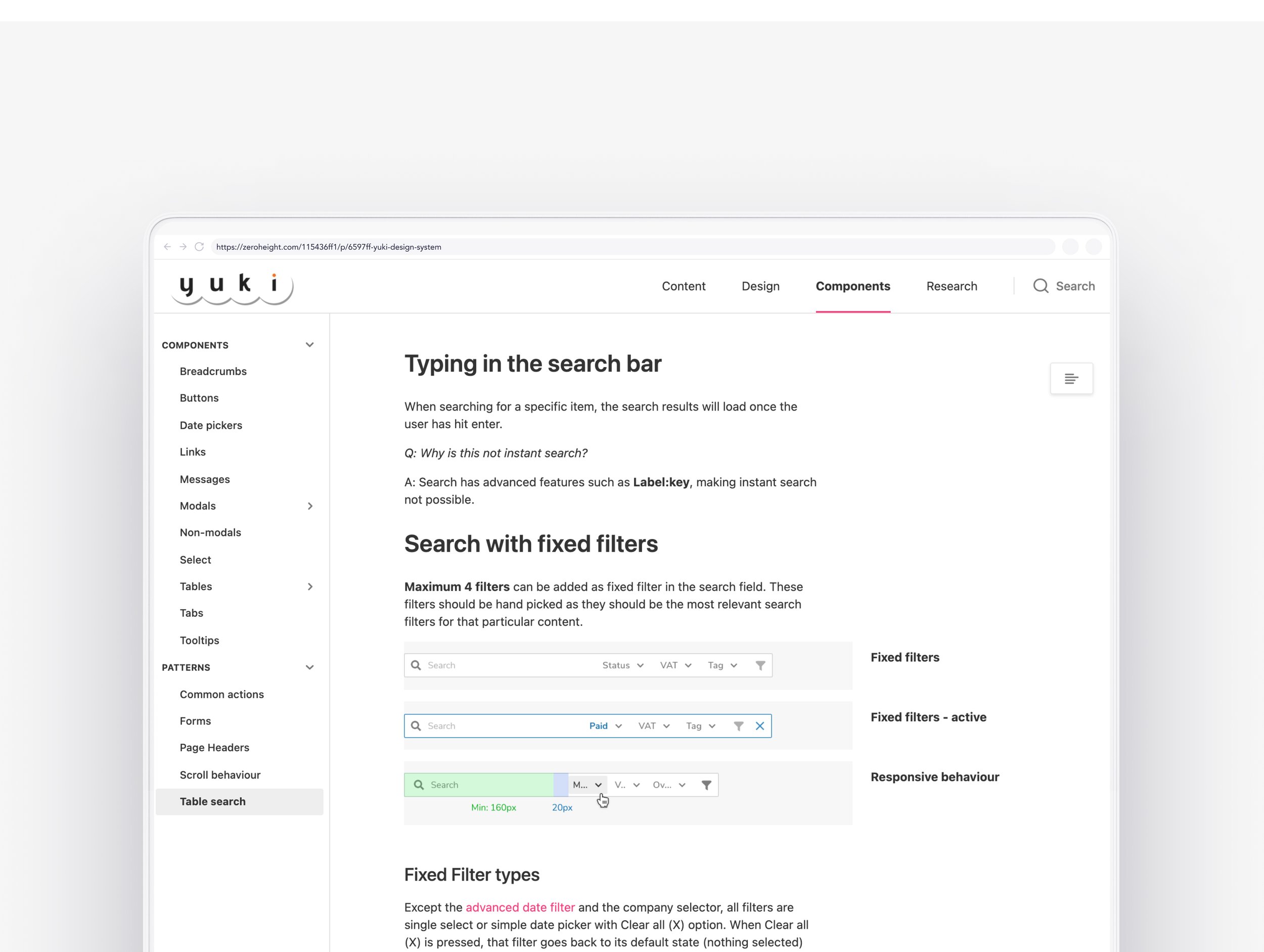
Confusing Navigation: Complex tables and forms weren’t always intuitive.
Outdated Look: The interface no longer reflected Yuki’s modern capabilities.
Limited Accessibility: Some users struggled with the design.
Difficult Maintenance: Without a unified system, updates were inefficient.
A full redesign was needed to bring everything together and make it easier to use.

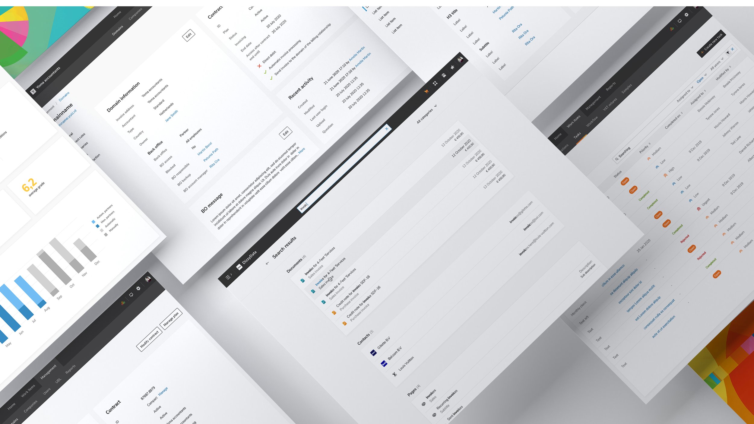
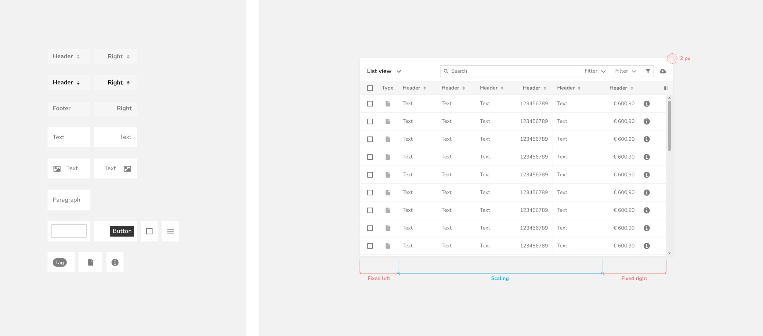
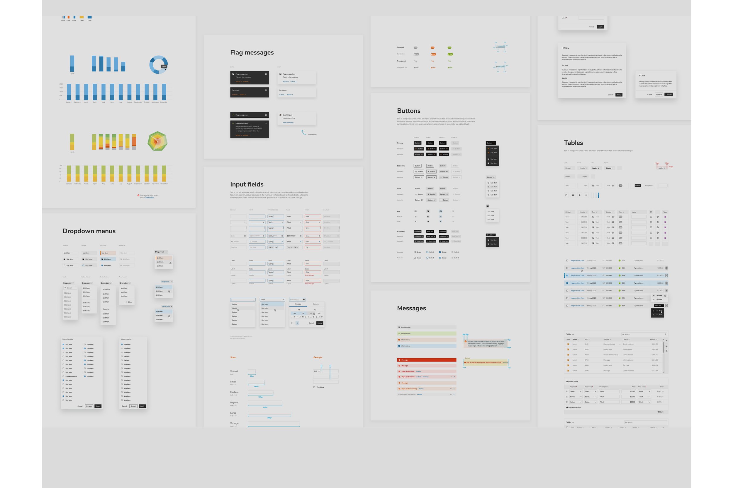
Inventory of existing components and patterns.
Groundwork
To set a strong foundation, we focused on:
User research: Learning what users needed and where they struggled
Brand alignment: Making sure the design reflected Yuki’s identity
Sketching and ideation: Exploring ideas early and often
Goal setting: Defining what success looked like
Moodboarding: Setting a tone that felt right for the brand and product
These steps helped us design a product that matched user needs and business goals.
Understanding the user

Embracing the brand

Workshop and moodboard

Sketching
Mood goals
Our goal with the re-design was to make the users feel:
Unburdened: I feel relieved knowing Yuki will notify me about what I need to know, when I need to know it, and what I need to do. This allows me to focus on what truly matters to me.
Effective: I can complete my work quickly, stay in control, and feel productive.
Happy: I keep returning to the application because it’s enjoyable to use.
Calm: The app helps me complete my tasks without being intrusive.
Innovative: I’m using a smart product powered by the latest modern technology.Trust: I feel confident that the numbers provided are accurate.
Clear: I understand how the app works and what’s relevant to me.
Convenient: The platform is intuitive, easy to use, and fits seamlessly into my daily life.
Yuki: I instantly recognize this as a Yuki product.


Strategy
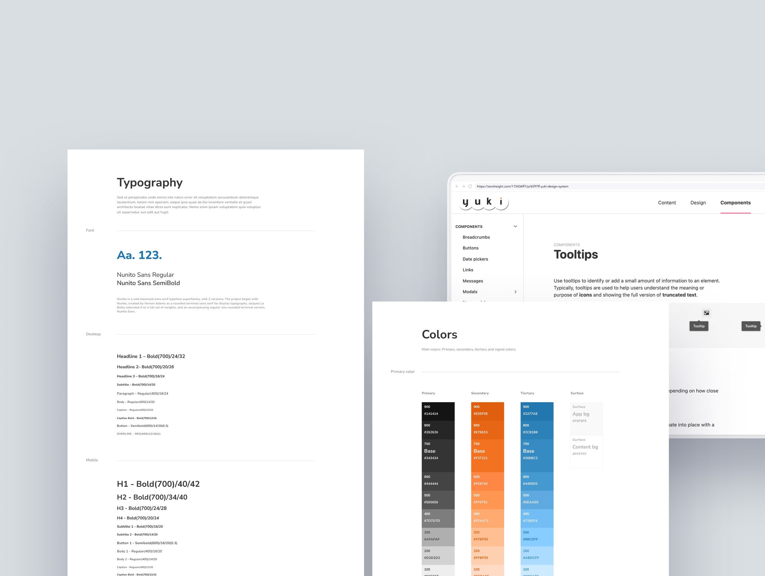
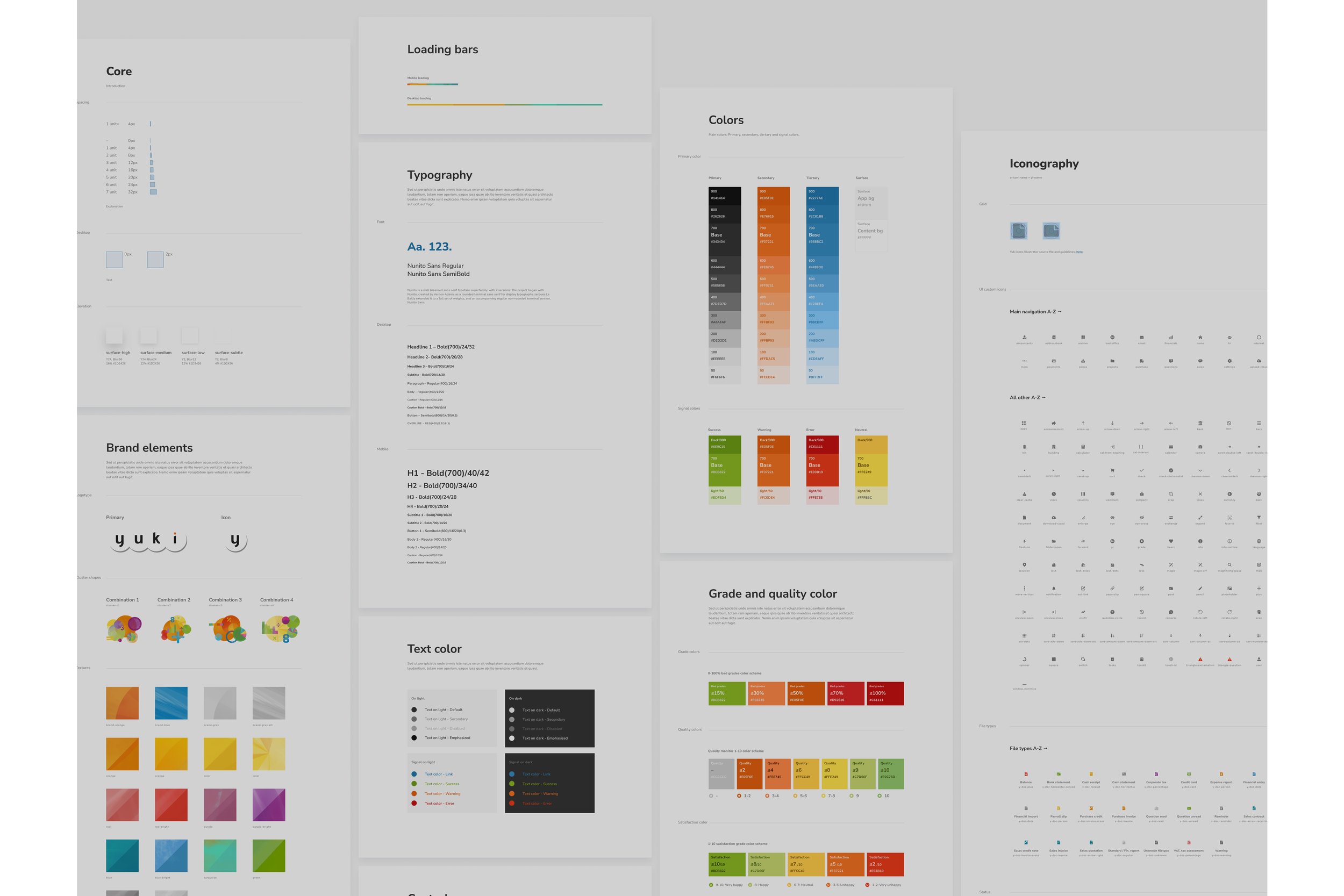
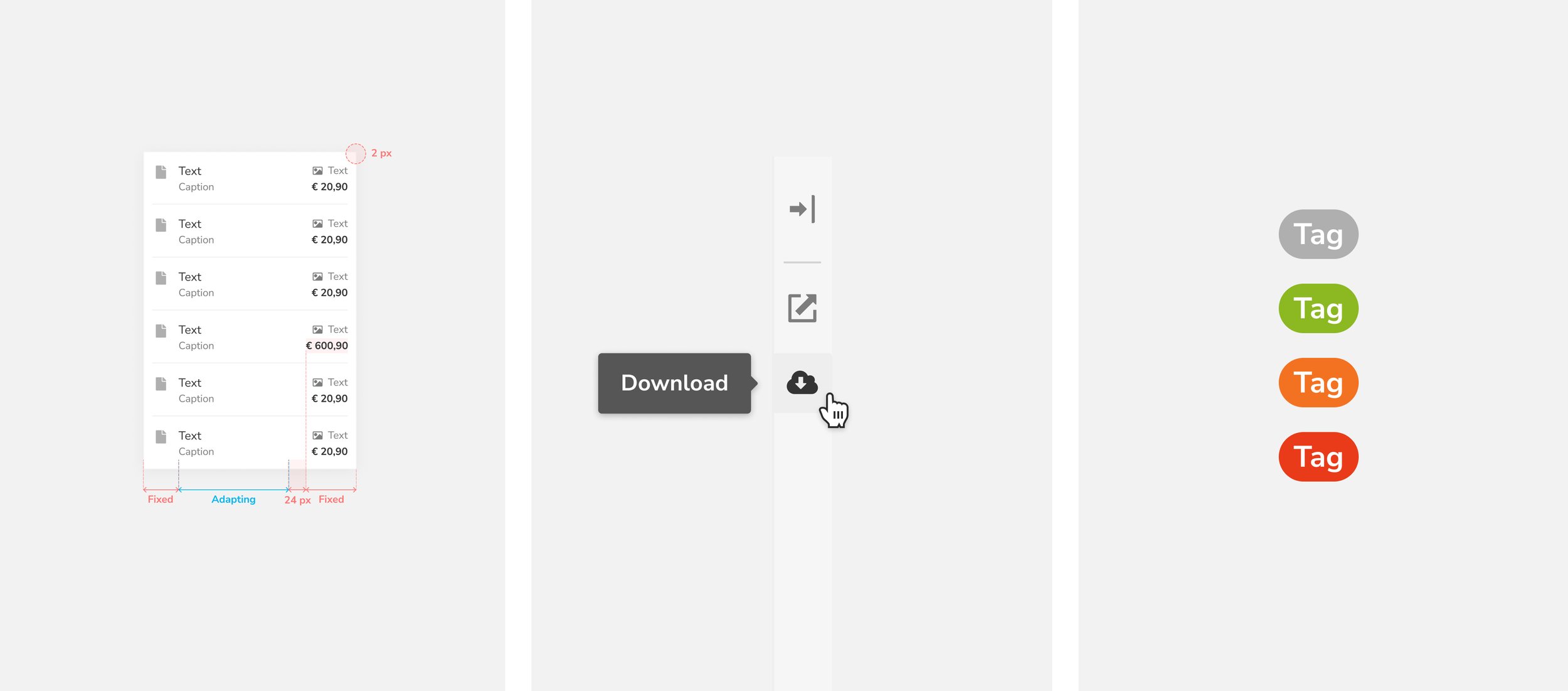
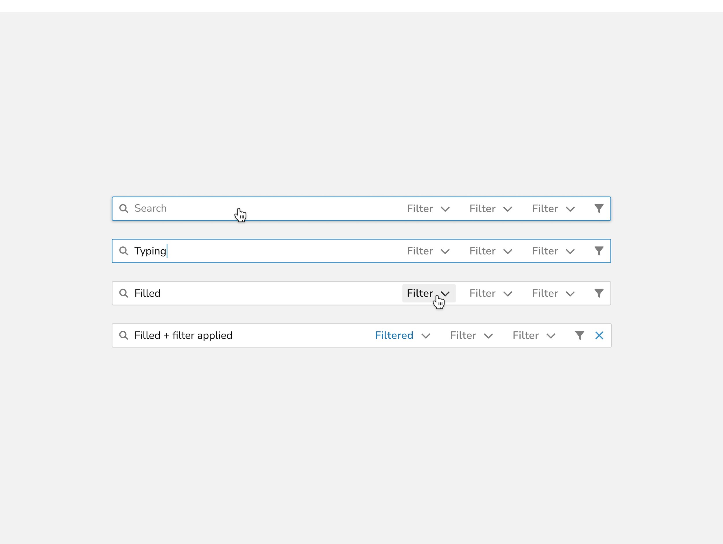
Yuki Design System
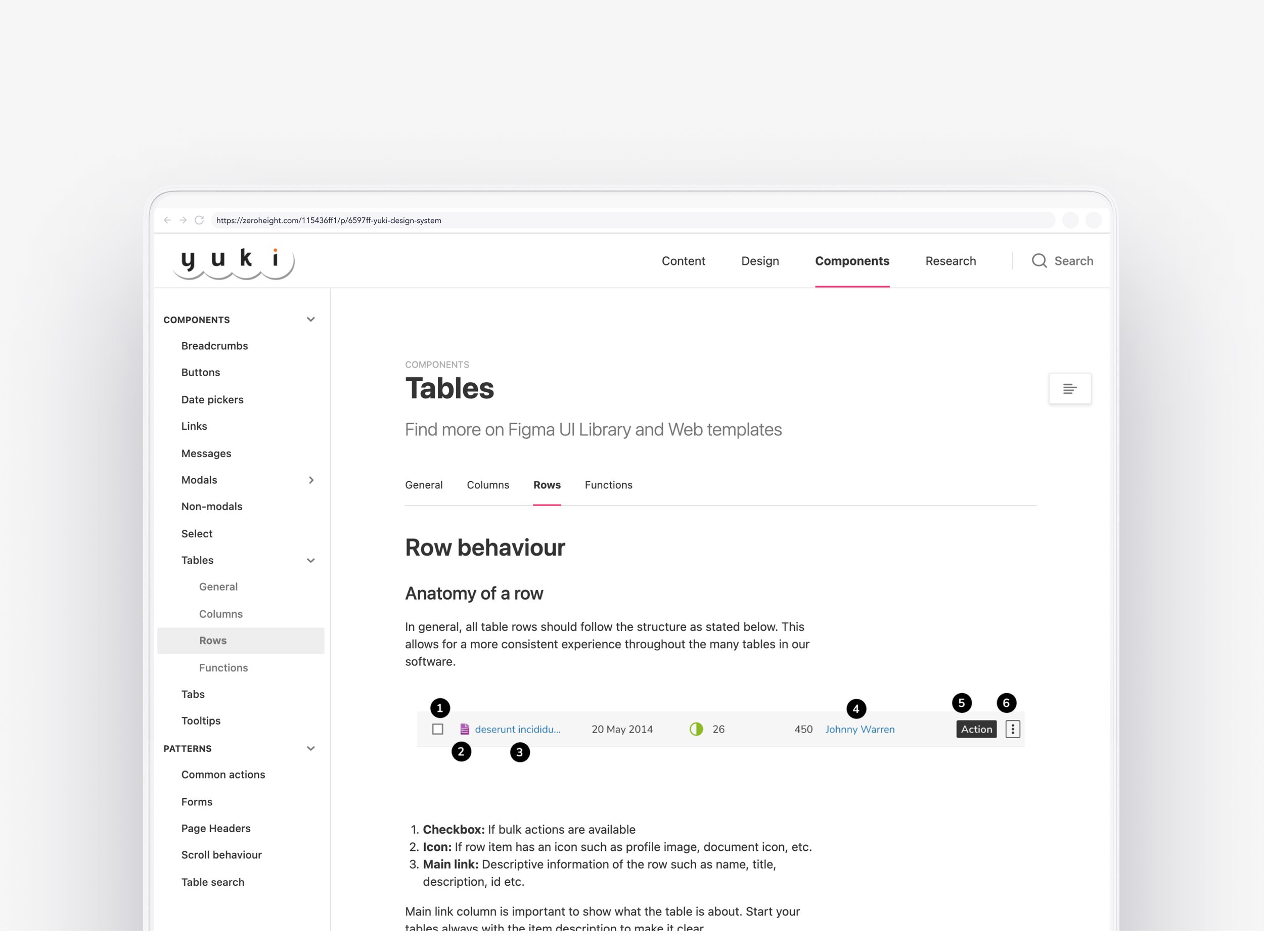
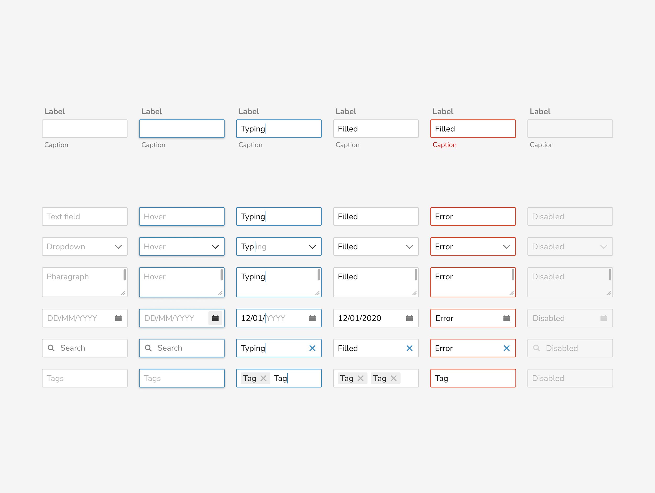
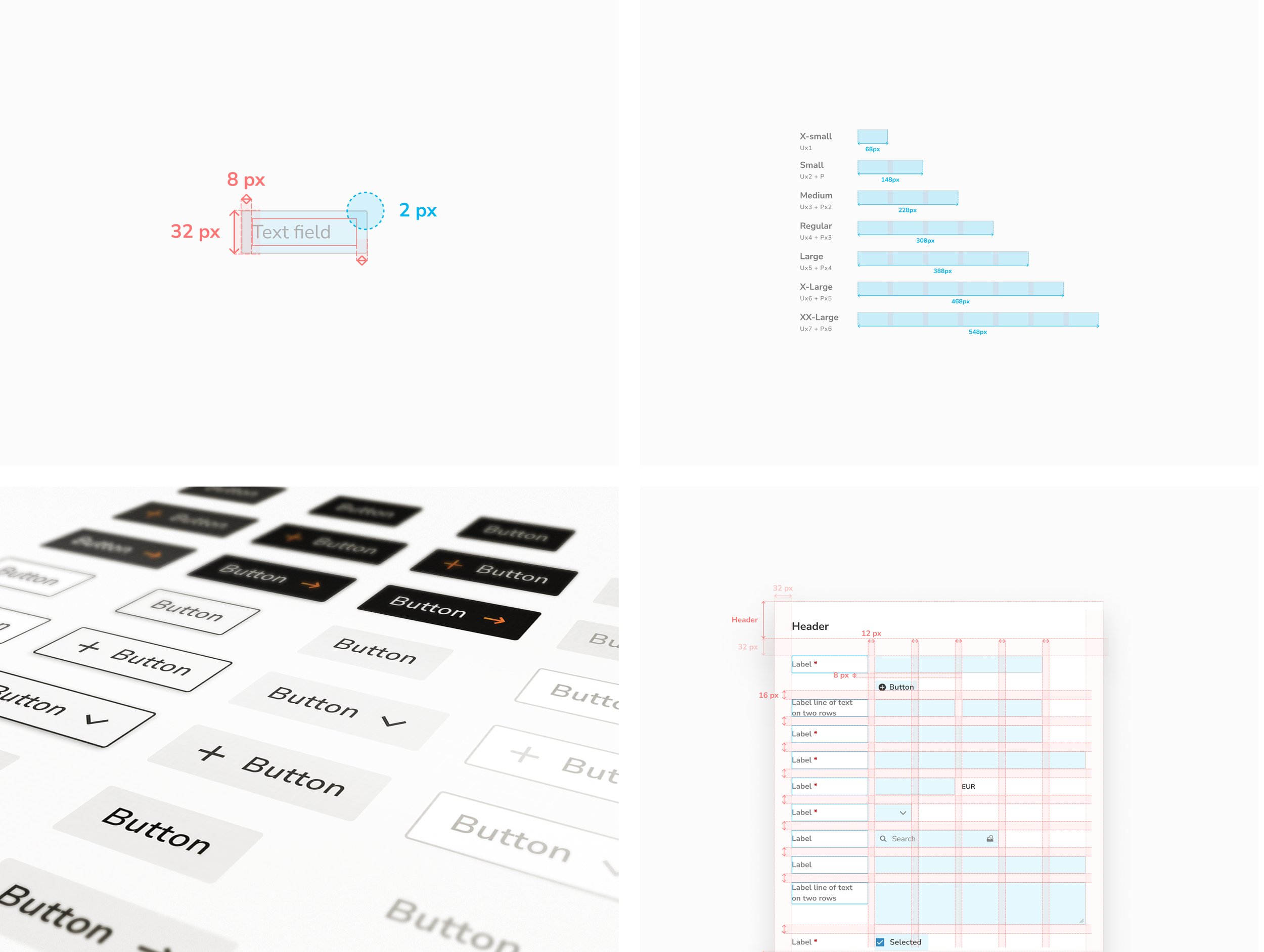
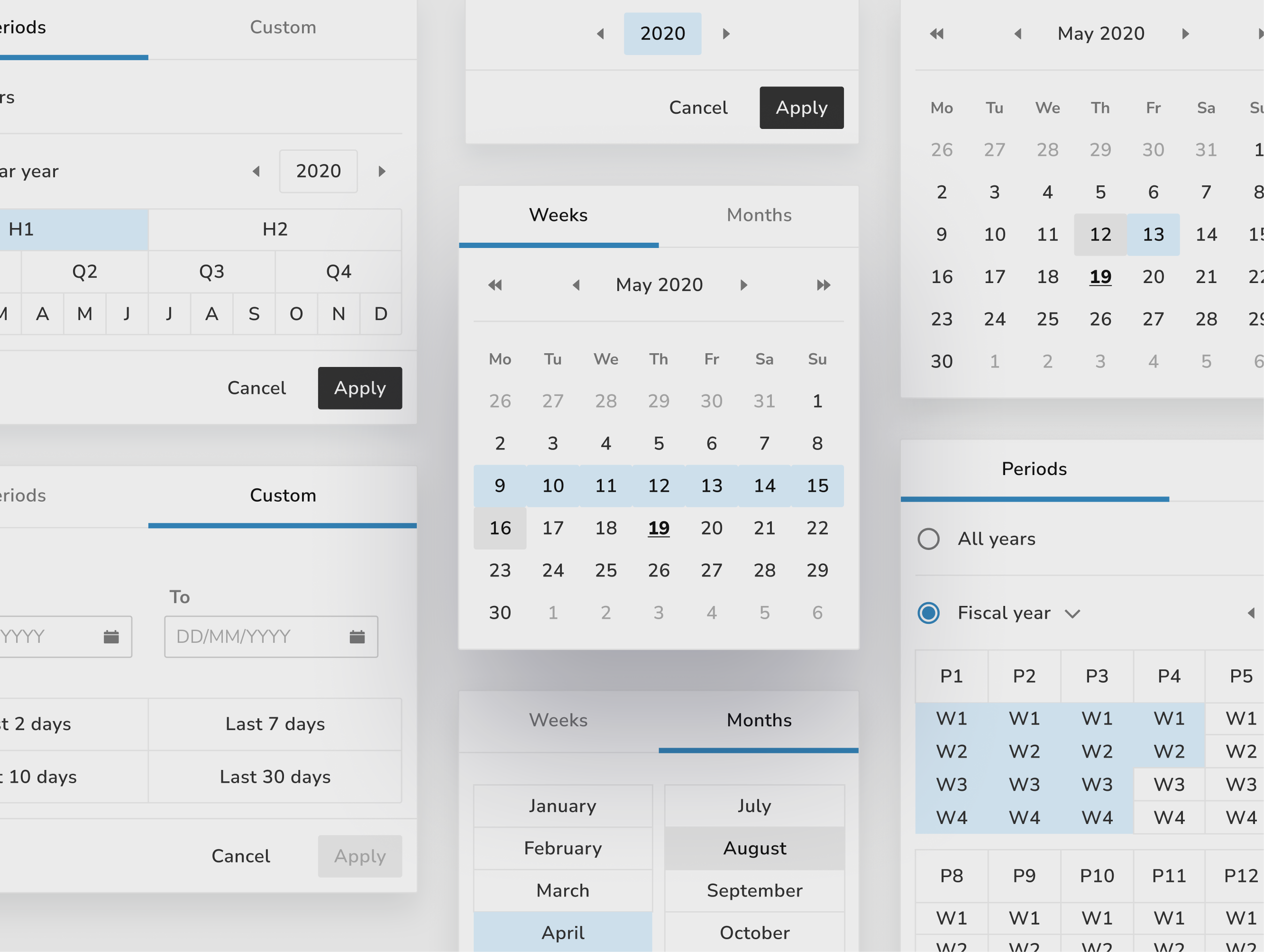
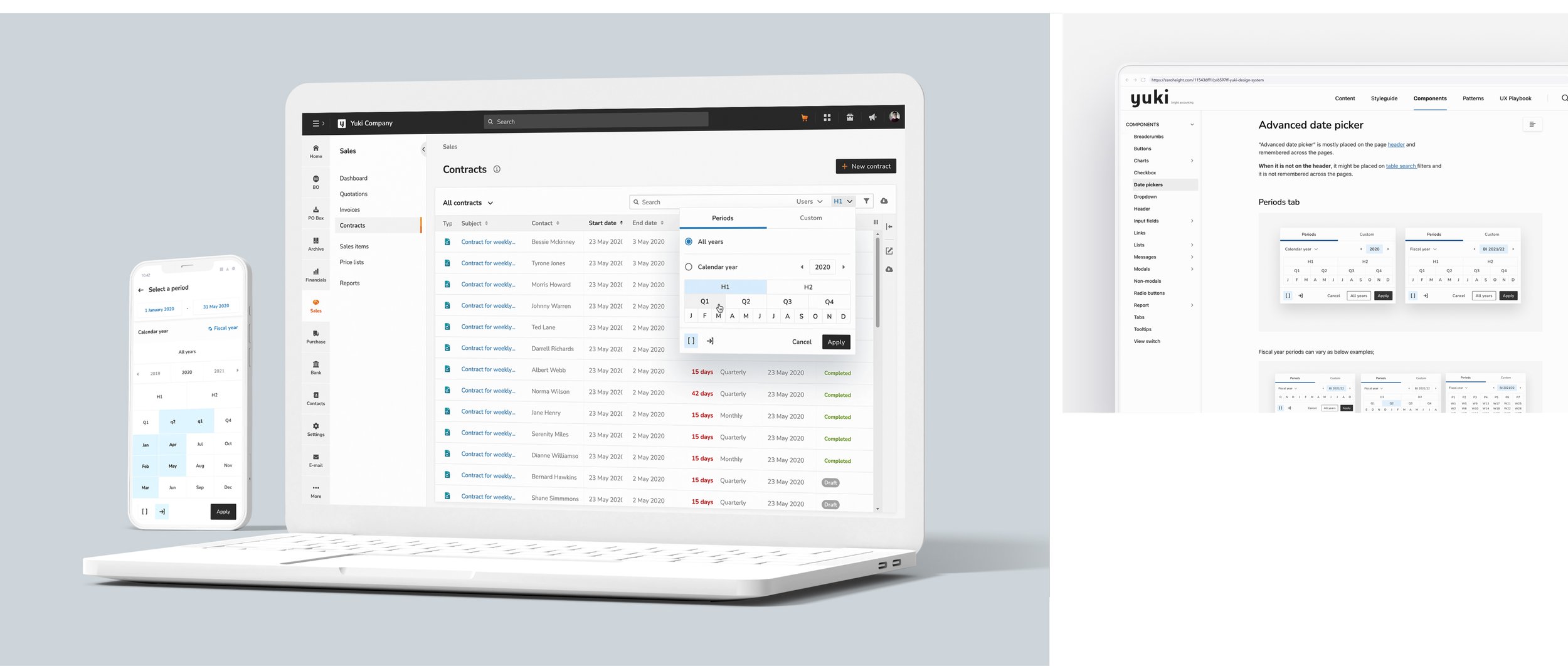
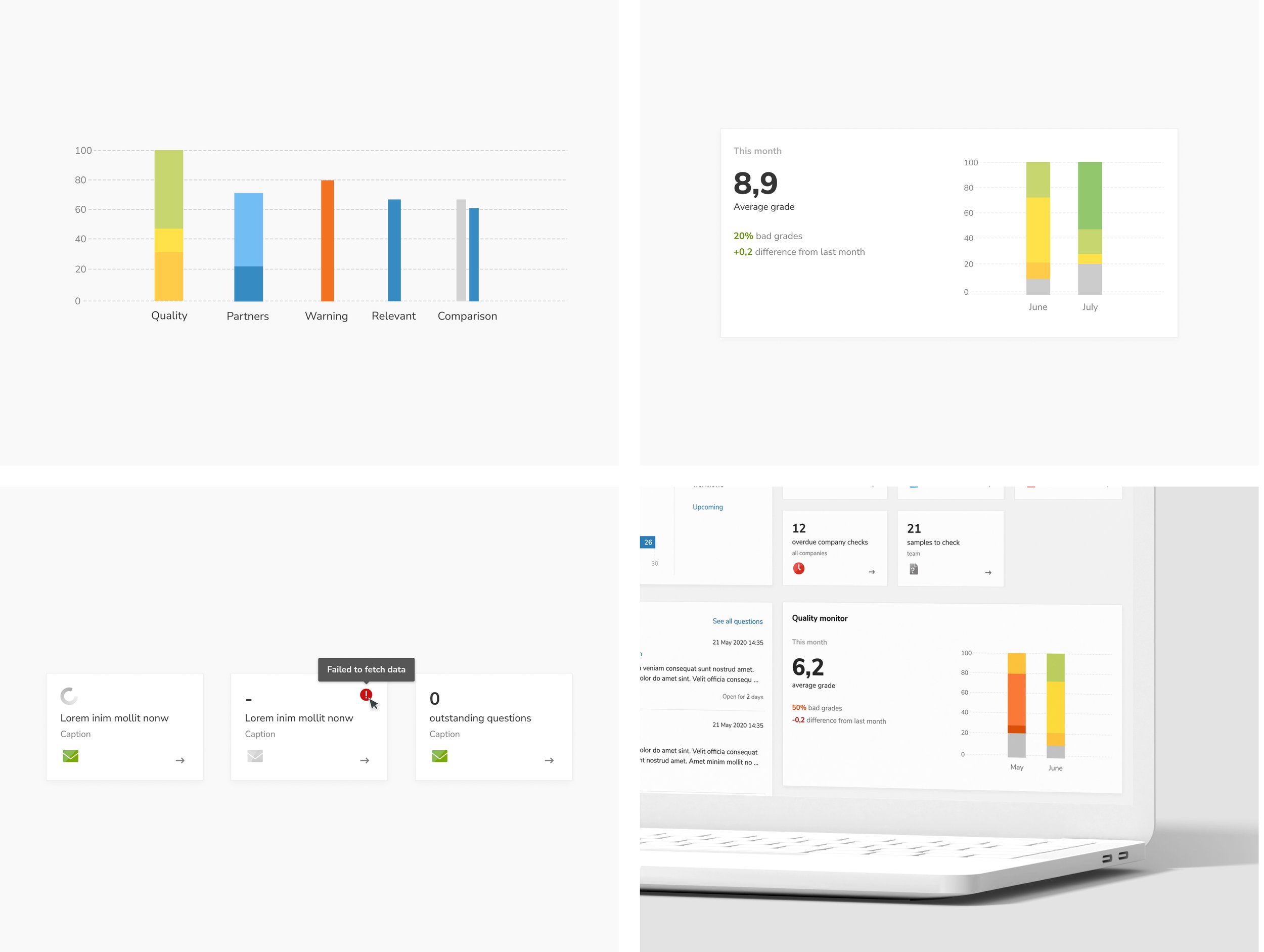
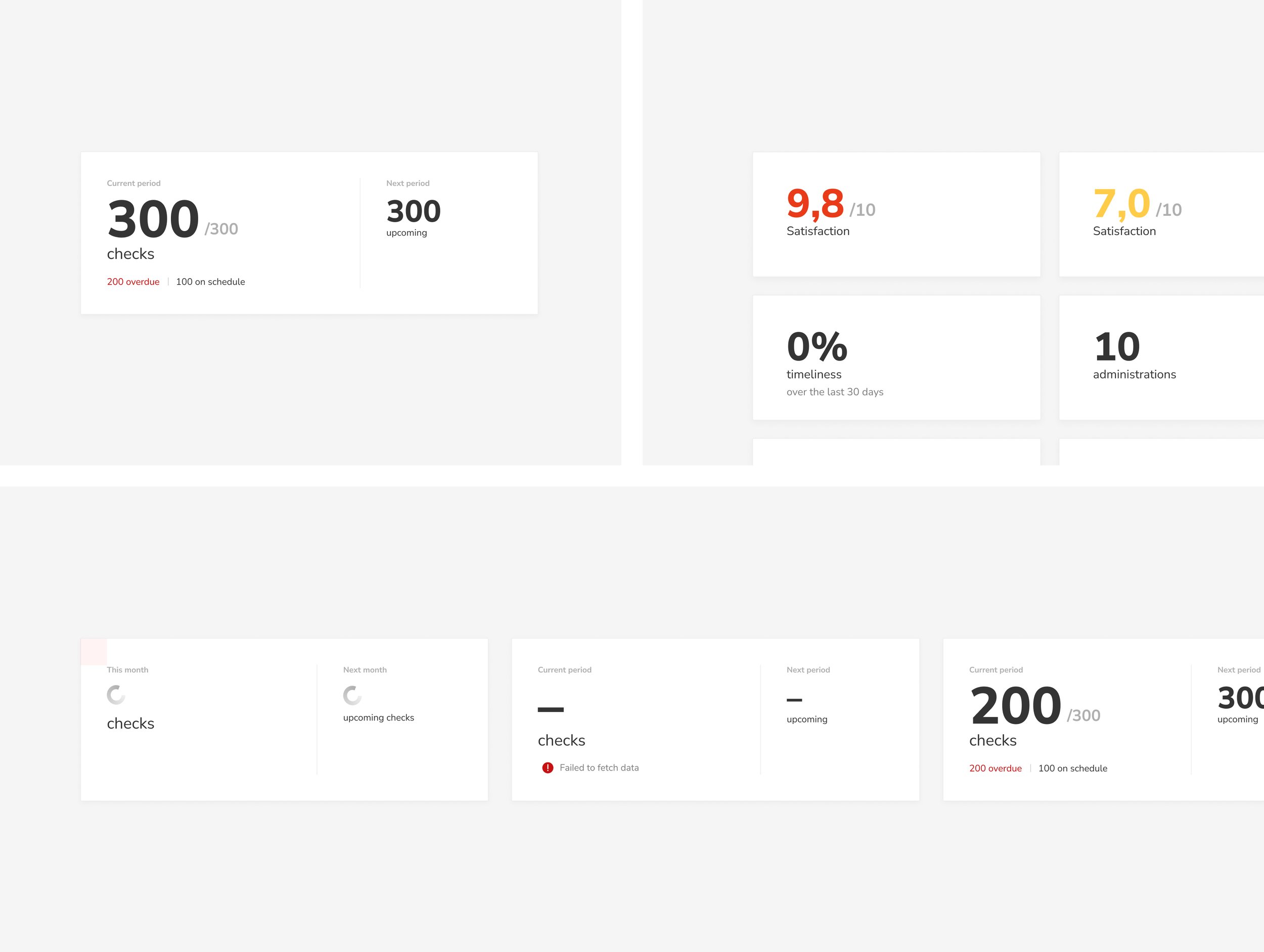
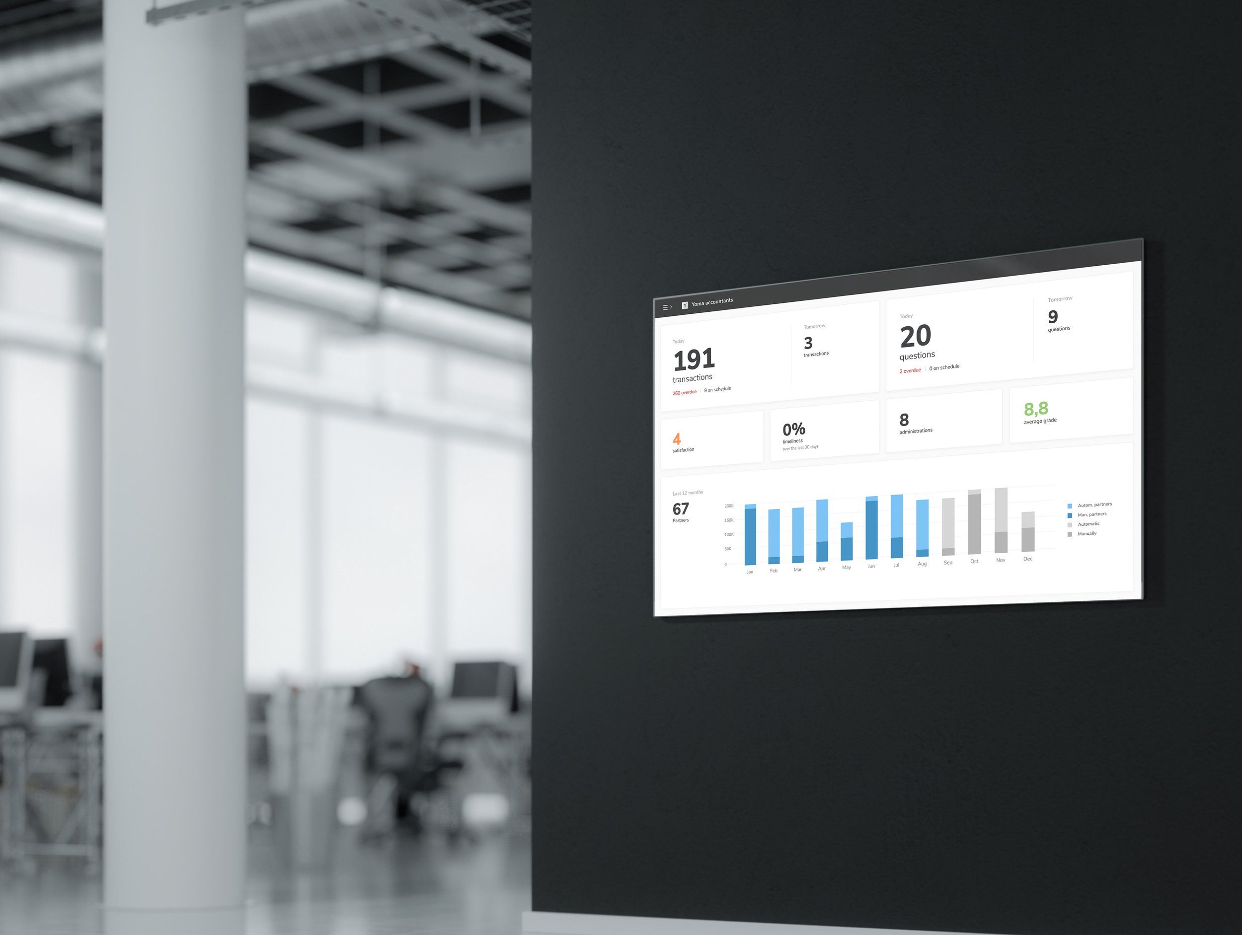
To ensure quality and scalability, we created the Yuki Design System using a modular approach based on atomic design principles. We built reusable, scalable components, established core styles and templates for consistency across platforms, and improved accessibility through thoughtful use of color, typography, and visual elements.


Reflection
This project was both a creative and technical challenge. We had to find the balance between playfulness and professionalism, something not always easy in a financial product.
At first, I struggled to fully embrace Yuki’s bold brand. My early designs leaned too safe. Thanks to feedback from the team, I learned to trust the color, embrace the energy, and still keep things clear and usable. In user testing, we saw that this boldness could actually help guide attention and improve the experience.
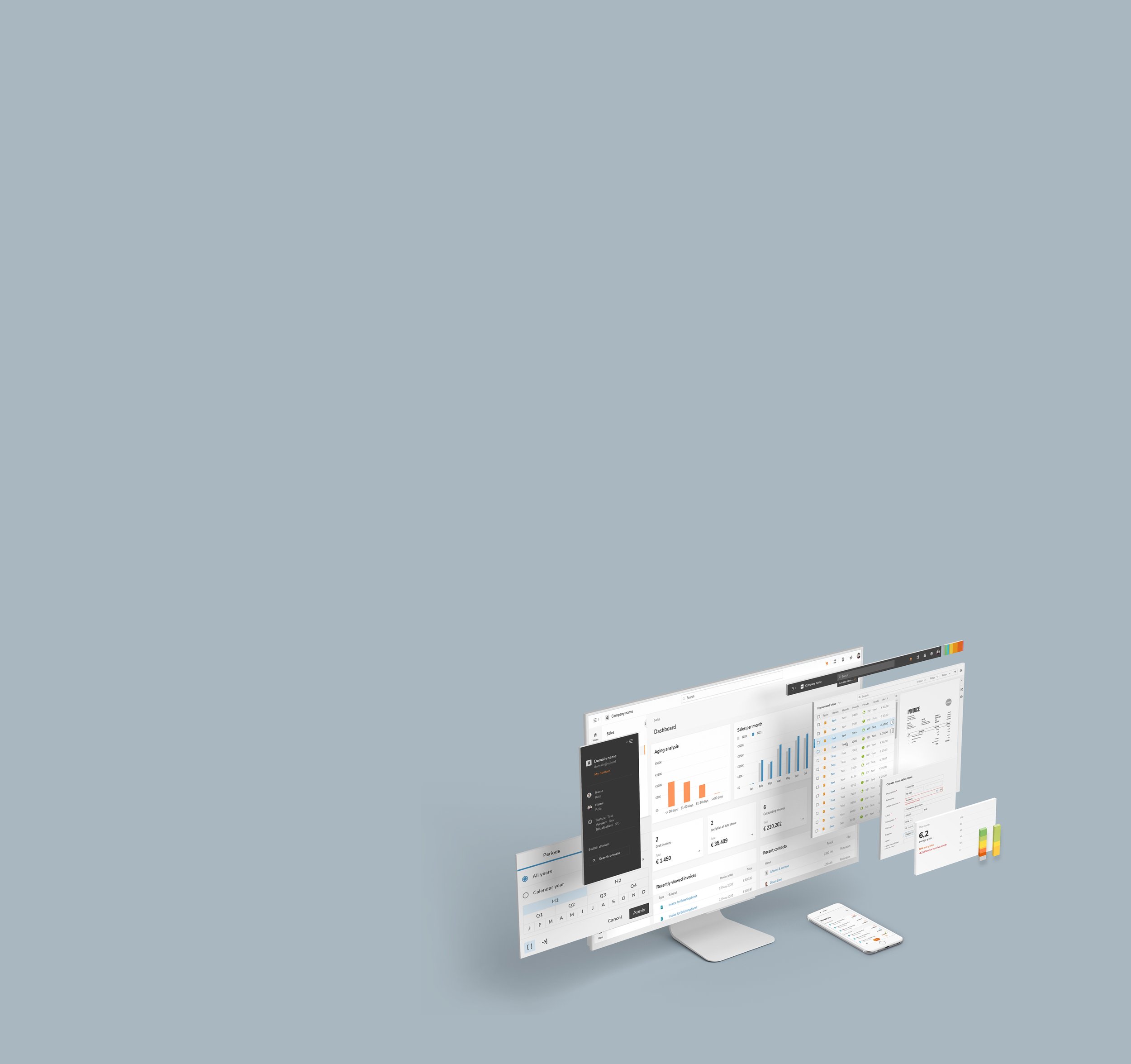
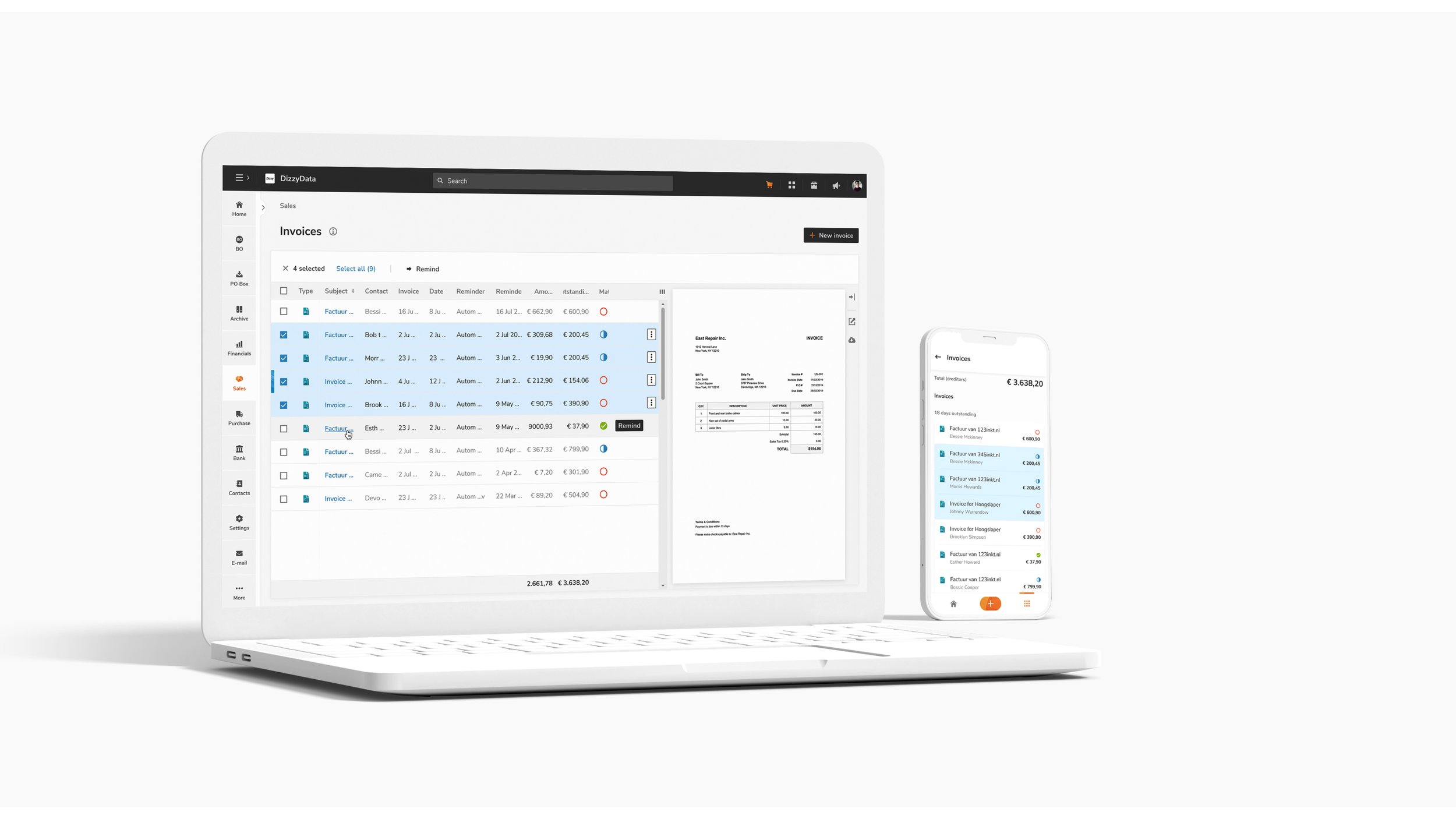
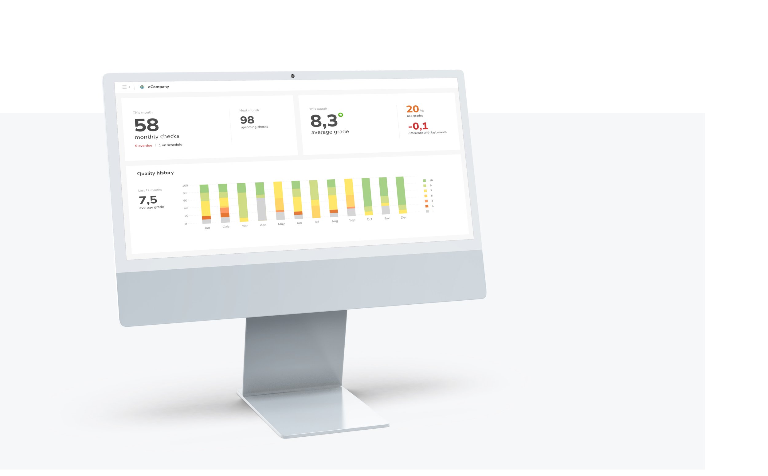
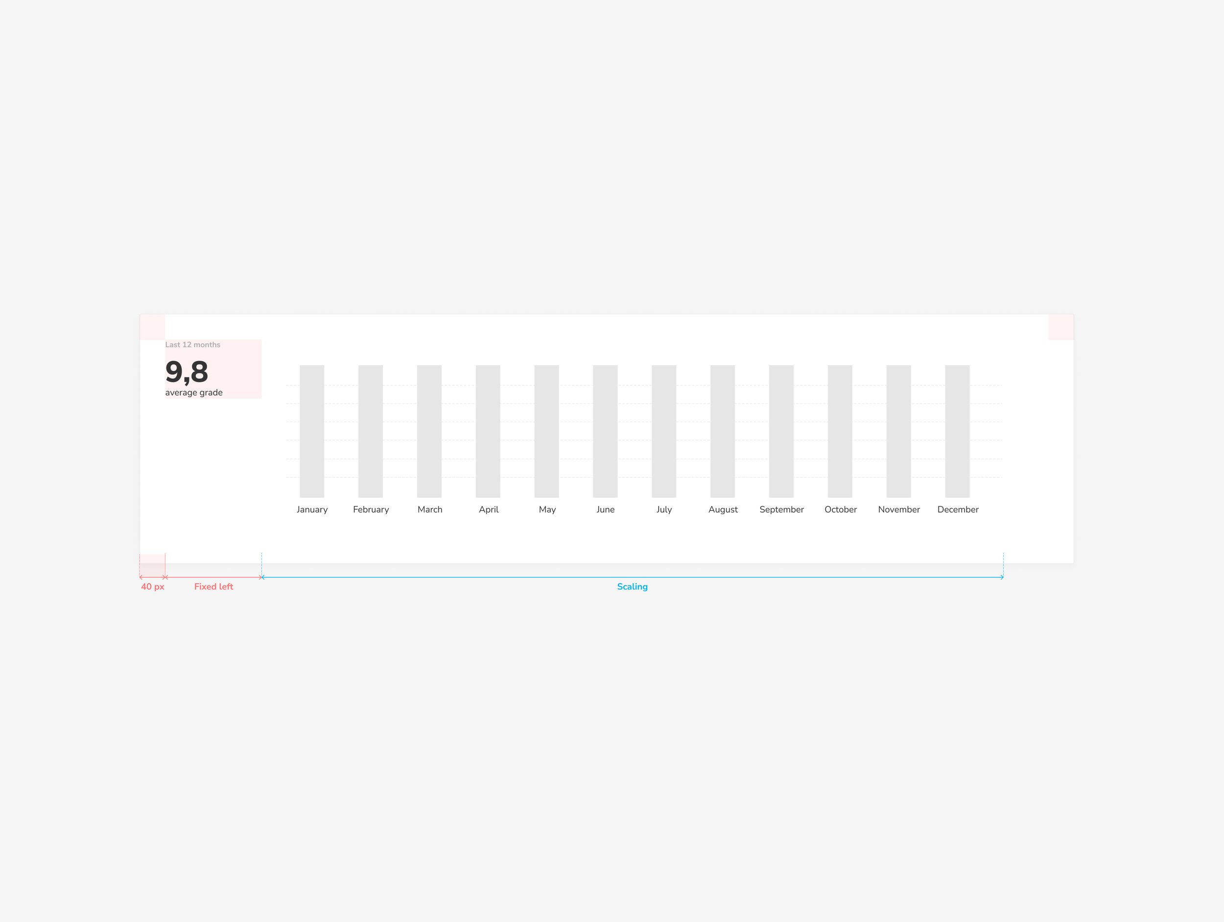
Rethinking graphs was another key part. Making them readable on both desktop and mobile took several iterations, but the result was intuitive and accurate.
I also saw how important a strong design system is for scaling and collaboration. It gave teams shared tools and language, which sped things up and improved quality across the board.
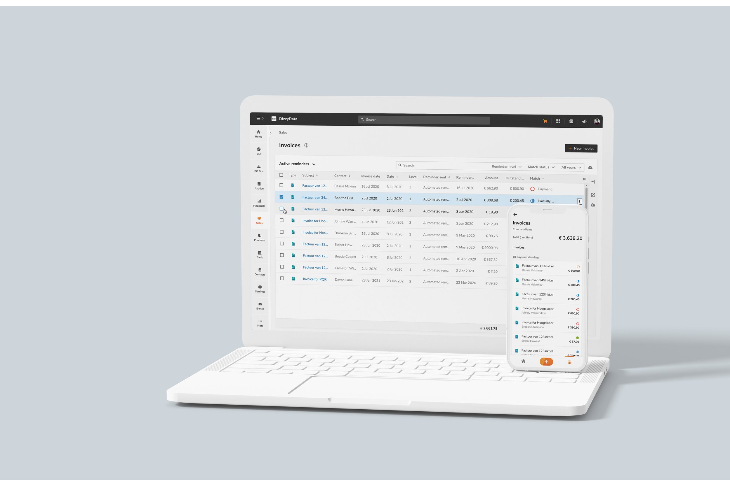
Results
The new Yuki platform is clear, enjoyable and efficient.
Tasks are easier to complete
Interfaces are cleaner and more intuitive
Features feel more personal and relevant
Data is accurate and easy to trust
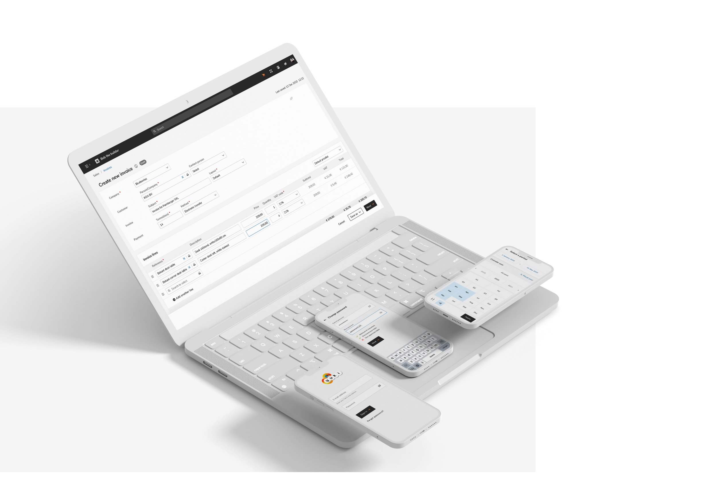
And it all works consistently across platforms
The design system played a big role in this success, as did the teamwork behind it. I’m especially grateful to my manager, Merve, who encouraged bold ideas and helped shape them into a system that truly reflects Yuki’s spirit.